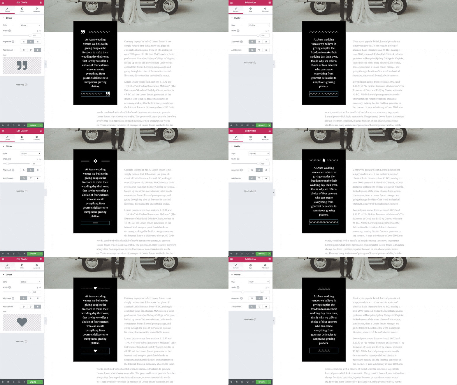
The Divider Widget allows you to add styled horizontal lines that divide your content.
You can choose either the standard line with nicely styled effects, or select from a variety of 25+ SVG dividers for enhanced design styling.
In addition, you can include text or icons before, after, or in the middle of your divider.


Content
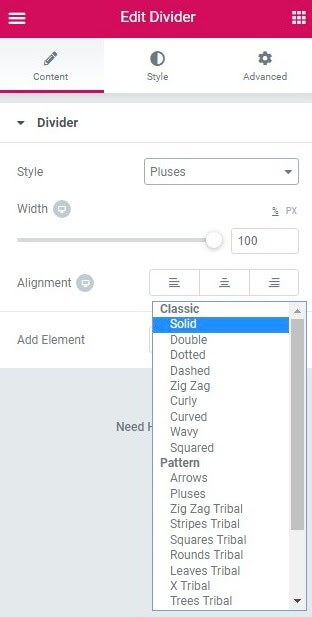
- Style: Choose between many classic and patterned styles, such as solid, curly, wavy, tribal patterns, arrows, pluses and more.
- Width: Control the width of the divider as percentage from 0 to 100 percent.
- Alignment: Align the divider to the left, center or right of the page.
- Add Element: Select from None, Text, or Icon. Select Text or Icon allows you to either enter the Text to be included or select or upload an icon from the Icon Library.
Style
Divider
- Color: Choose the color of the divider
- Size: Set the size/height of the divider, from 1 to 100, in either pixels or as a percentage
- Amount: Set the number of patterned elements to show
- Gap: Slide to set the gap above and below the divider, from 1 to 50
Text
- Color: Choose the text color
- Typography: Set the typography options for the text
- Position: Choose the position of the text in relation to the divider, selecting from Left, Center, or Right
- Spacing: Slide to add space between the text and the divider line, from 1 to 50
Icon
There are 3 different VIEWS for the widget: Default, Stacked, and Framed. Each comes with its own set of options.
VIEW: Default
- Size: Set the size of the icon
- Primary Color: Choose the icon color
- Position: Choose the position of the icon in relation to the divider, selecting from Left, Center, or Right
- Spacing: Slide to add space between the icon and the divider line, from 1 to 50
- Rotate: Slide to select the number of degrees to rotate the icon, from 0 to 360
VIEW: Stacked
- Size: Set the size of the icon
- Padding: Set the padding around the icon
- Primary Color: Set the color of the stack background
- Secondary Color: Set the color of the icon
- Position: Choose the position of the icon in relation to the divider, selecting from Left, Center, or Right
- Spacing: Slide to add space between the icon and the divider line, from 1 to 50
- Rotate: Slide to select the number of degrees to rotate the icon, from 0 to 360
- Border Radius: Set the border radius of the stack background to achieve rounded corners are completely round stacks
VIEW: Framed
- Size: Set the size of the icon
- Padding: Set the padding around the icon
- Primary Color: Set the color of the frame border
- Secondary Color: Set the color of the icon
- Position: Choose the position of the icon in relation to the divider, selecting from Left, Center, or Right
- Spacing: Slide to add space between the icon and the divider line, from 1 to 50
- Rotate: Slide to select the number of degrees to rotate the icon, from 0 to 360
- Border Width: Control the thickness of the frame border
- Border Radius: Set the border radius of the frame border to achieve rounded corners are completely round frames
Advanced
Set the Advanced options that are applicable to this widget