Add the widget to the canvas
- In Elementor Editor, click +.
All available widgets are displayed. - Click or drag the widget to the canvas. For more information, see Add elements to a page.
A logo is essential for establishing brand identity, credibility, and site recognition. It helps people know what the website is all about and remember it later. Plus, if you click on it, it’s like a little map back to the main page!
The Site Logo is a dynamic widget that displays the site logo. However, the logo can only be replaced or deleted in the Elementor Site Identity Settings or WordPress Customizer. With this widget, you have control over design stuff, like its size, where it sits on the page, and more.
Sam is building a website for a design agency. They want the website to reflect the agency’s unique style and showcase their portfolio of stunning designs. As Sam works on the homepage & designs the header, they decide to use the Site Logo widget to add the agency’s logo to the top-left corner of the page.
In addition, Sam takes advantage of the widget’s customization options to experiment with different logo placements and sizes on various pages, ensuring that the logo complements the content and design of each page.
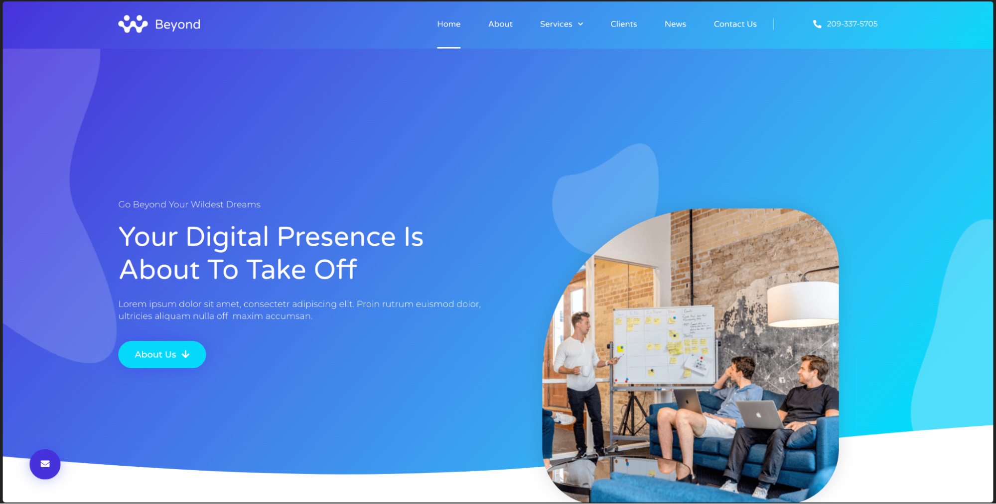
- Add logo to website’s header using the Site Logo widget.
- Uses the Site Logo widget to ensure brand consistency across all pages on the client’s website.
- Utilizes the Site Logo widget to showcase the company’s logo prominently on e-commerce websites.
- Add the Site Logo widget to the canvas. For details, see Add elements to a page.
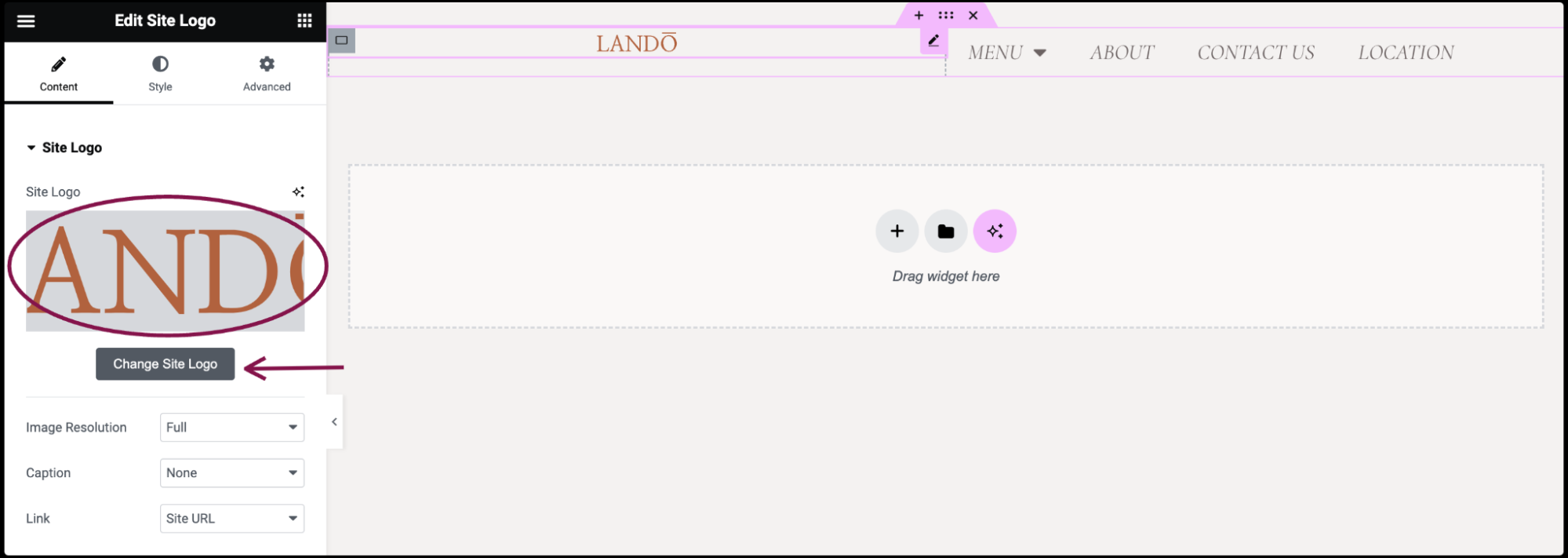
- In the Content tab, the Site Logo field automatically fetches your logo from either Elementor Site Identity settings or WordPress Customizer. You can update or replace your logo by clicking the gray Change Site Logo button.
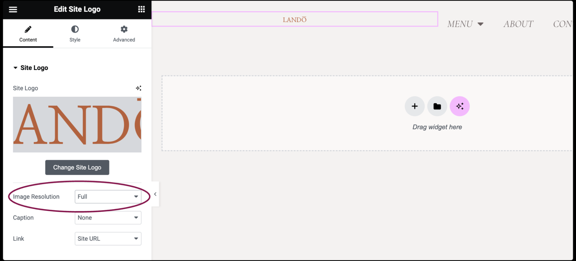
- In the Image Resolution field, adjust the logo size from small to full or set a custom size.
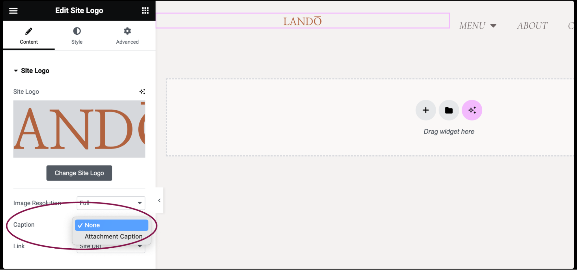
- (Optional) In the Caption field, add a caption below the logo. Choose from None or Attachment Caption.
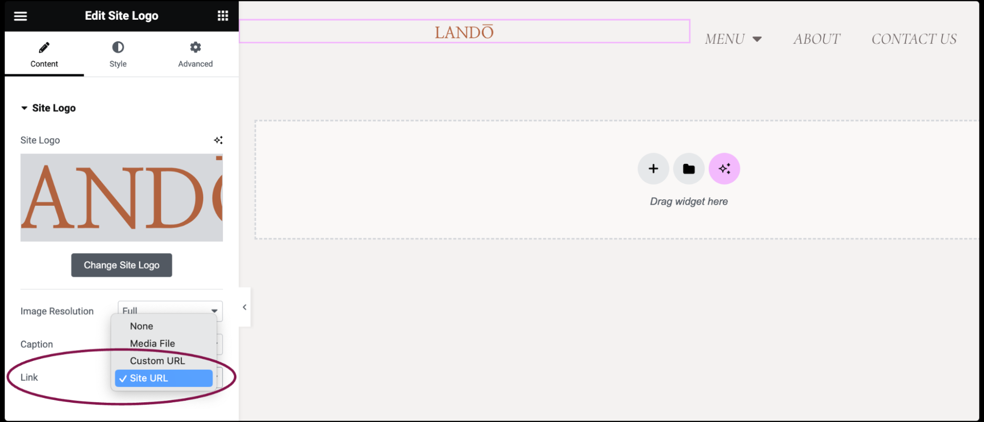
- Use the Link field to make your logo clickable. Set the link destination to Media Files, add a Custom URL, or choose None.
- If you choose Media Files, you get an option to open the logo in a Lightbox:
– You can choose whether to show the logo in a lightbox. Selecting Yes or No will override the default lightbox setting.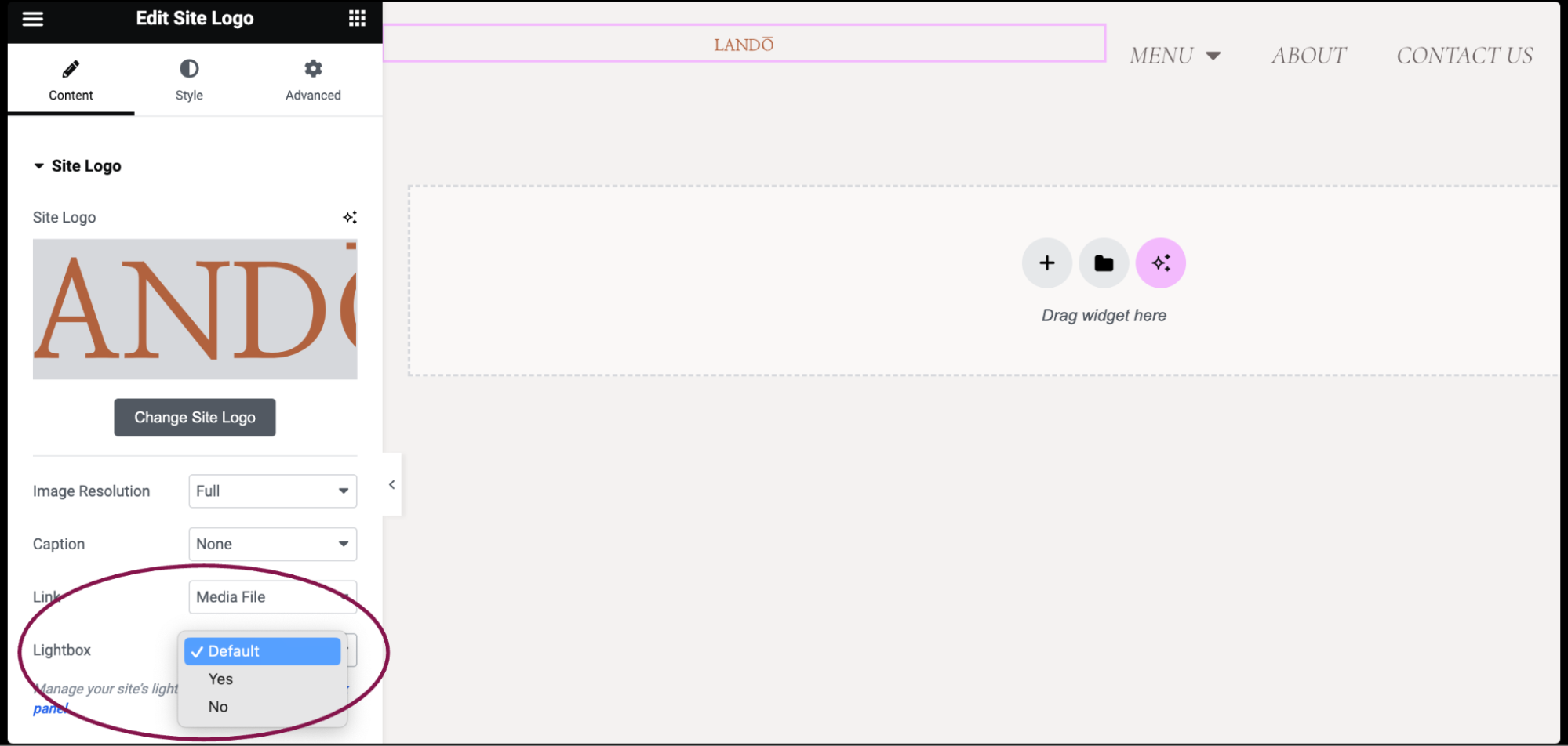
- If you’re adding a Custom URL:
– Click the ⚙️ to set the link to either open in a new window or to add rel=nofollow to the link.
– Use the Custom Attributes option to assign custom attributes to the link element. Use the | (pipe) for key-value separation and commas to separate pairs.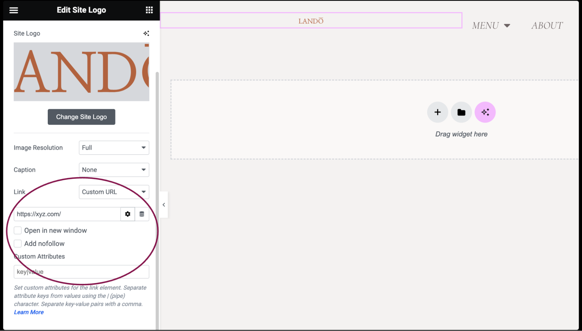
- If you choose Site URL, the link will automatically lead to the main domain or homepage of your website. This ensures that clicking on the logo takes users back to the starting point of your site.
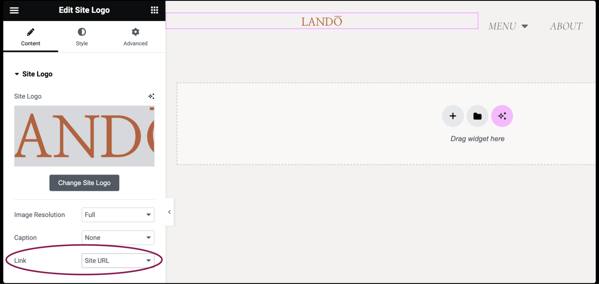
- If you choose Media Files, you get an option to open the logo in a Lightbox:
You can customize your widgets using content, style, and other advanced parameters, offering you great flexibility in tailoring them to your needs. Click the tabs below to see all the settings available for this widget.
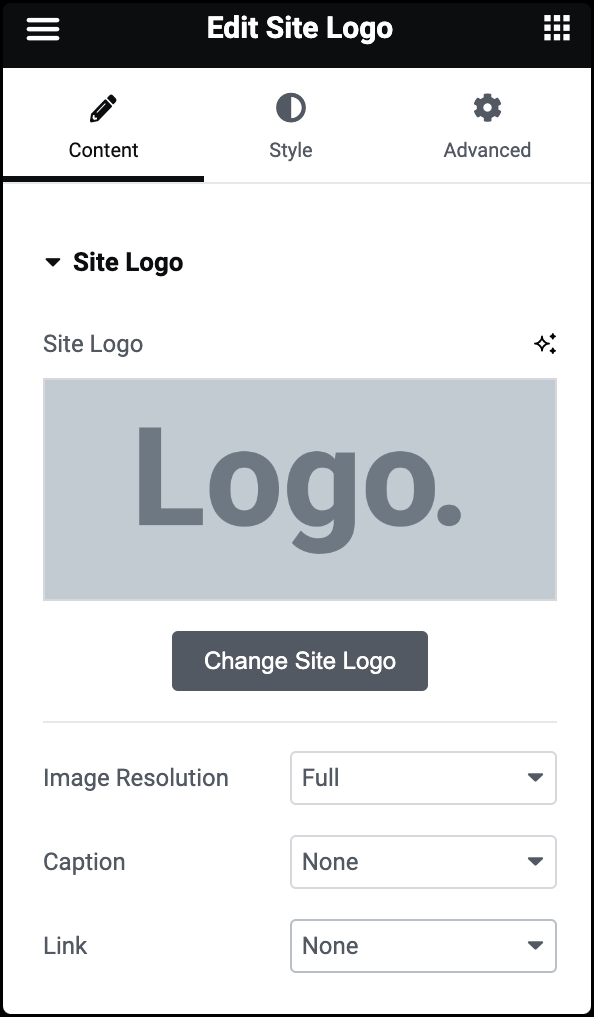
Site Logo
The image is dynamically retrieved from the Elementor Site Identity settings or the WordPress Customizer. You can edit or change your logo in either of those places.
Image Resolution
Set the resolution of the image, from thumbnail to Full, or enter a custom size.
Caption
Add a caption to the bottom of the image. Select None or Attachment Caption.
Link
Set the logo’s link, selecting from None, Media File, or Custom Link.
- If Media File is chosen, set the Lightbox to Default, Yes, or No.
- If Custom Link is chosen, the URL will be dynamically retrieved for you.
- If the Site URL is chosen, the link will automatically lead to the main domain or homepage of your website.
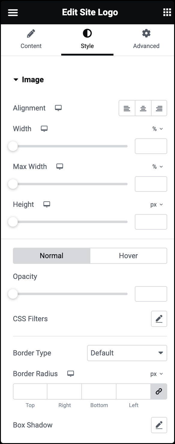
Alignment
Align the logo to the left, right, or center of the webpage.
Width
Set the width of the logo in either PX, EM, REM, %, VW, or V. For more details, see Units of measurement.
Max Width
Set the maximum width of the logo as a percentage.
Height
Choose a height for the logo image using the slider. After selecting the height, you can pick how the image fits:
The options for Object Fit are:
- Fill: Makes the logo completely cover the space, even if it changes the logo image’s shape.
- Cover: Stretches the logo to fit the width but might cut off parts of it.
- Contain: Keeps the whole logo inside, but you might see blank areas around it.
Normal
Determine how the logo appears by default.
- Opacity: Adjust the logo transparency.
- CSS Filters: Apply filters such as Blur, Brightness, Contrast, and Saturation.
Hover
Determine how the logo appears when moused over.
- Opacity: Adjust the logo transparency when a user hovers over the logo.
- CSS Filters: Apply filters such as Blur, Brightness, Contrast, and Saturation when a user hovers over the logo.
- Transition Duration: Determine the duration of the hover animation
- Hover Animation: Click the dropdown to choose hover effects that activate when someone hovers over the logo.
Border Type
Select a border style from None, Solid, Double, Dotted, Dashed, or Groove. For more details, see Border type.
Border Radius
To create rounded corners around the logo increase the border radius. For more details, see Border radius tools.
Box Shadow
Click the 🖋️ icon to add a shadow to the logo. Learn more about shadows.
The Advanced tab provides options to control widget position, adjust spacing, add custom code, and more.
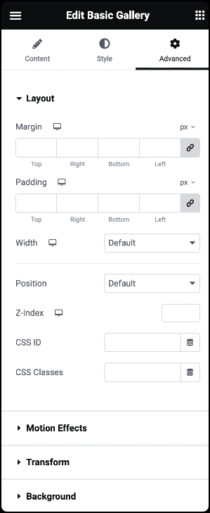
Advanced
Learn more about the Advanced tab settings.