Add the widget to the canvas
- In Elementor Editor, click +.
All available widgets are displayed. - Click or drag the widget to the canvas. For more information, see Add elements to a page.
The Post Info widget is a Theme Element. It is one of the available Single Post Template widgets that is used to dynamically display the current post’s meta data, such as author, date, time, and comments.
Further, you can customize how this information looks, like displaying meta data items vertically or horizontally, adjusting the spacing, and changing the font style.
Liam manages an online store selling crockery and tableware. In addition to showcasing the products, Liam recognizes the importance of providing engaging content to customers. Therefore, they decided to launch a blog section on the website where they share articles related to the products.
To ensure that each blog post reflects the professionalism and attention to detail of the brand, Liam integrates the Post Info widget into the single post templates. This widget dynamically displays key information, such as the author’s name, the publication date, and the post’s published date.
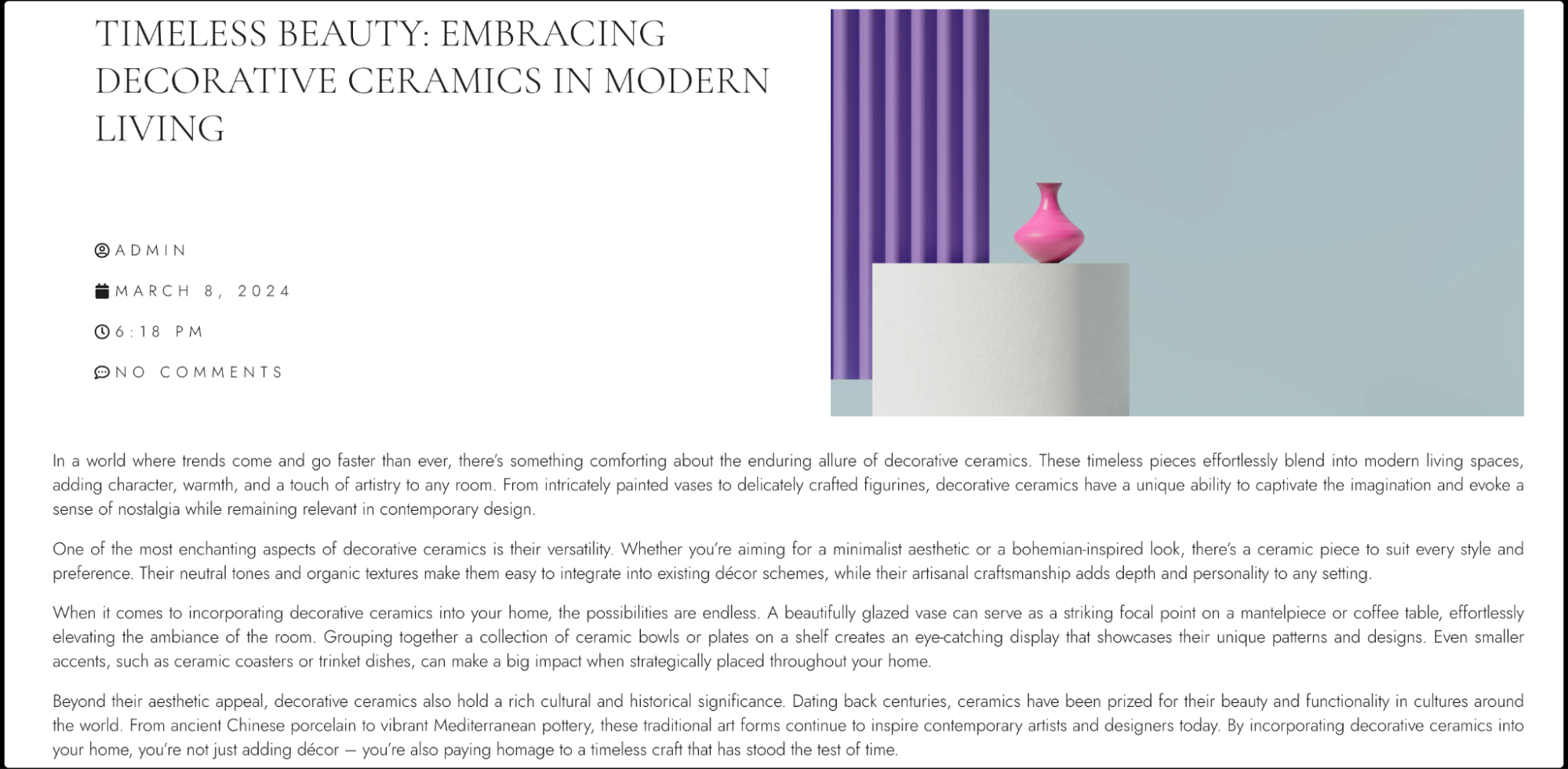
- Display author names, publication dates, and comment counts for blog posts.
- Showcase product details such as manufacturers, release dates, and customer reviews on e-commerce product pages.
- Present event information on event listing pages, like dates, times, and locations for upcoming events.
- Highlight recipe creators, cooking times, and recipe ratings on a food blog.
- Feature artist names, artwork creation dates, and medium descriptions on an art portfolio website.
- Add the Post Info widget to the canvas. For details, see Add elements to a page.ImportantThis widget is a REQUIRED element on the Single Post Template. If this widget is not added to the Single Post Template, the Elementor editor will not load. For more information, see Create a single post template.
- In the Content tab, Under the Meta Data section, use the Layout field to control the arrangement of the post info items. Choose between Default and Inline layout.
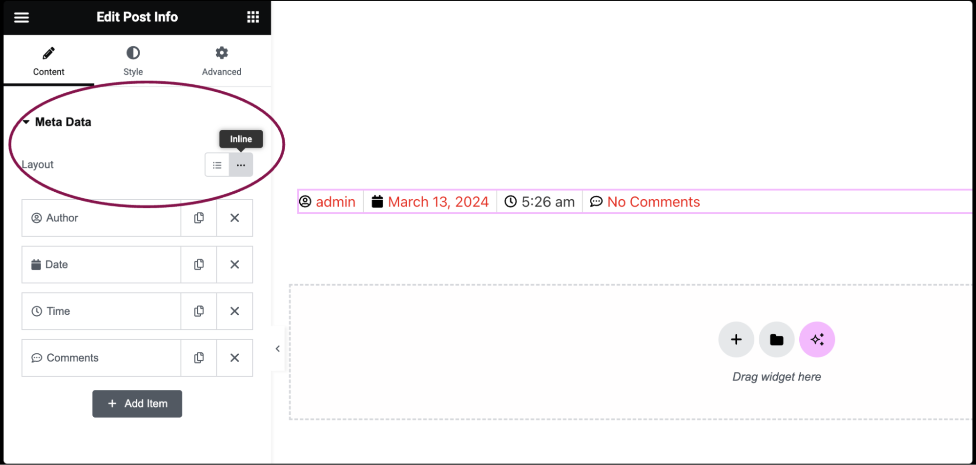
- The next options are displayed as a list of all the available meta data. The default meta items include Author, Date, Time, and Comments. You can delete default items and add additional items such as Terms and Custom.
- Click on the Add Item button to add a new post info meta item to the list.
- To duplicate or delete items, click on the item’s Duplicate or Delete
 icon.
icon.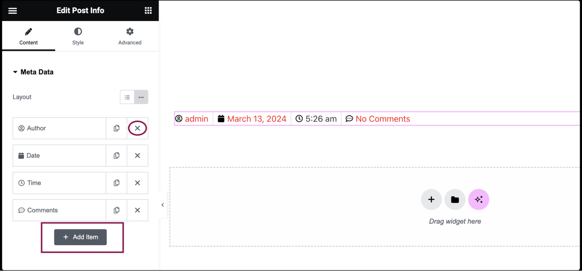 Each meta item has different customization options:
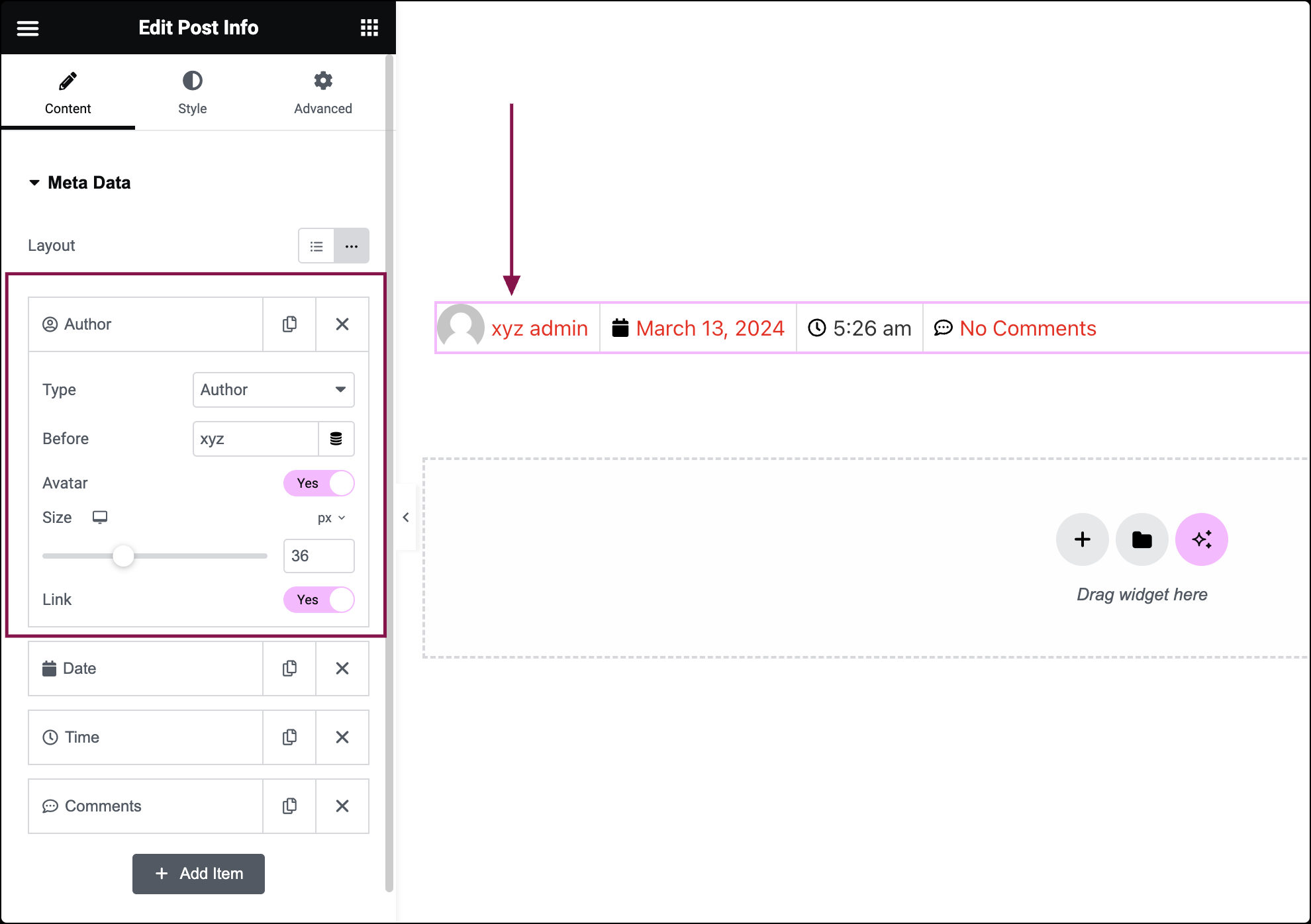
- For Author meta:
- In the Type field, from the drop-down menu, change the type of item from Author to Date, Time, Comments, Terms, or Custom.
- In the Before field, enter the text to be displayed before the author.
- Slide the Avatar toggle to YES to display the author’s avatar next to the author’s name.
- Slide the Link toggle to YES to link to the author’s archive.
- In the Icon field, select the icon for the meta item. Choose None, Default or Custom.
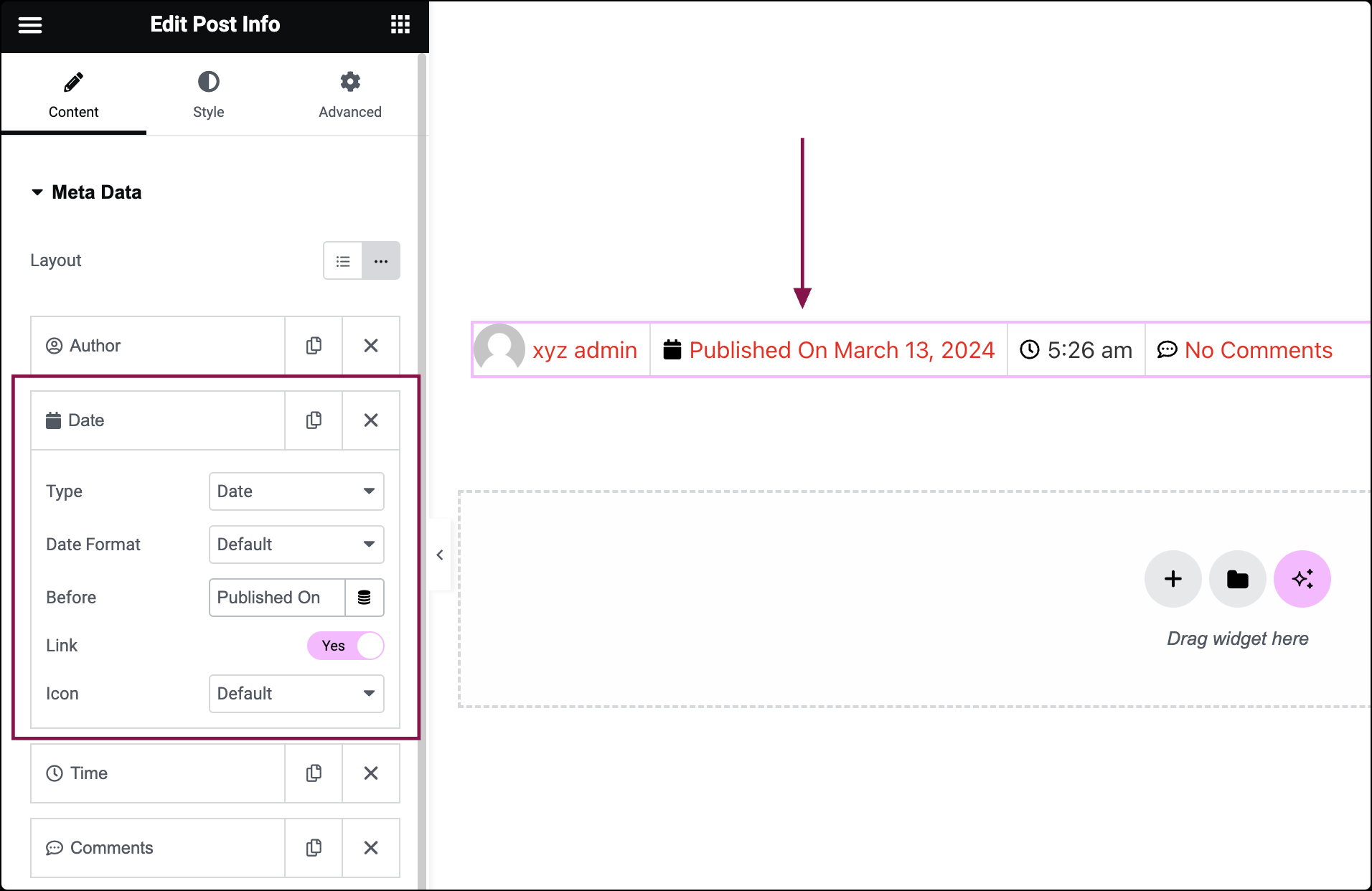
- For Date meta:
- In the Type field, from the drop-down menu, change the type of item from Date to Author, Time, Comments, Terms, or Custom
- In the Date Format field, select from several date formats or choose Custom to format your own.
- In the Before field, enter text to be displayed before the date, either as a value or using a Dynamic Tag.
- Slide the Link toggle to YES to link to that date’s archive.
- In the Icon field, select an icon for the meta item. Choose None, Default, or Custom.
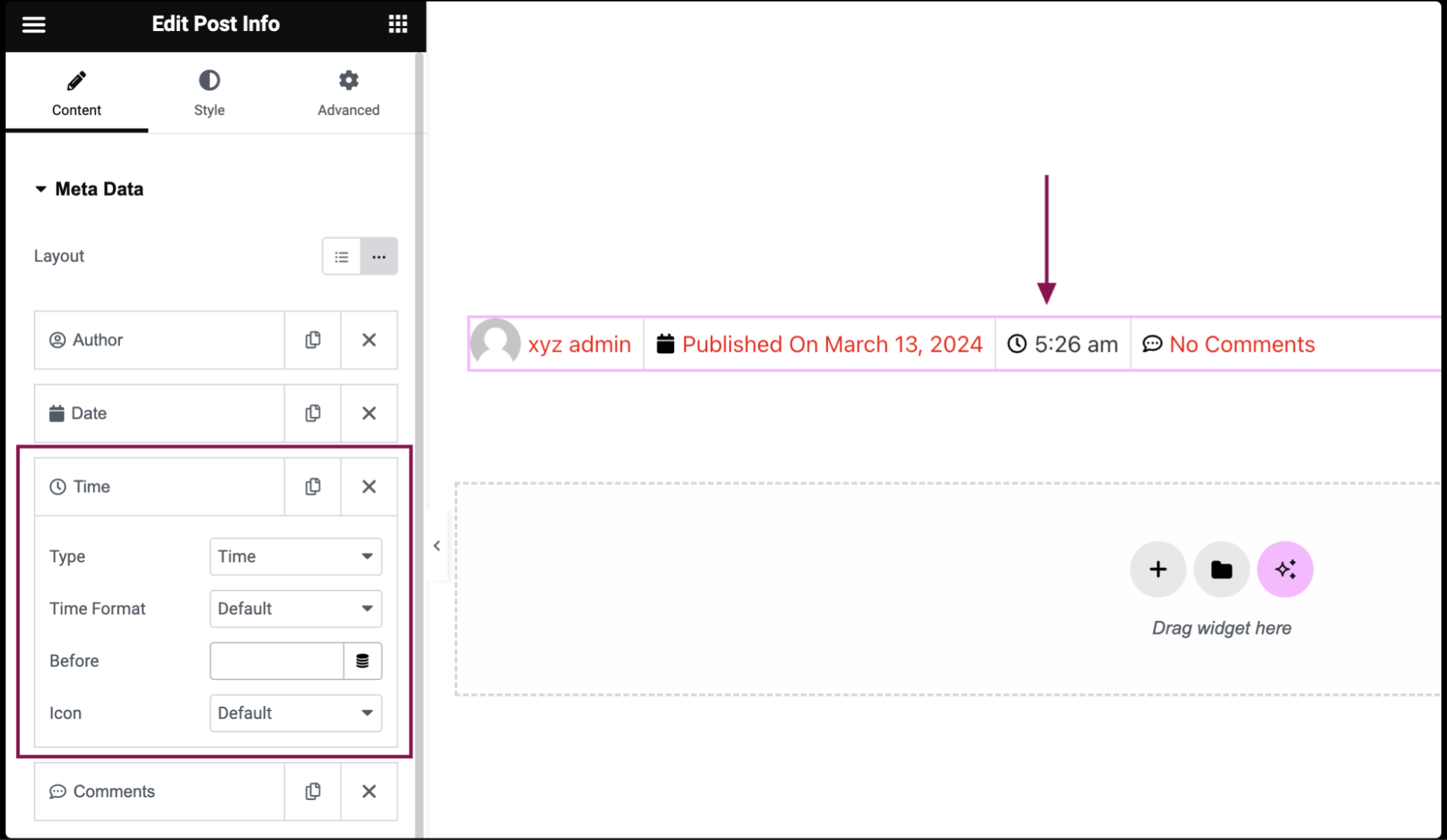
- For Time meta:
- In the Type field, from the drop-down menu, Change the type of item from Time to Author, Date, Comments, Terms, or Custom.
- In the Time Format field, from the drop-down menu, select from several time formats or choose Custom to format your own.
- In the Before field, enter the text to be displayed before the time.
- In the Icon field, select an icon for the meta item. Choose None, Default, or Custom.
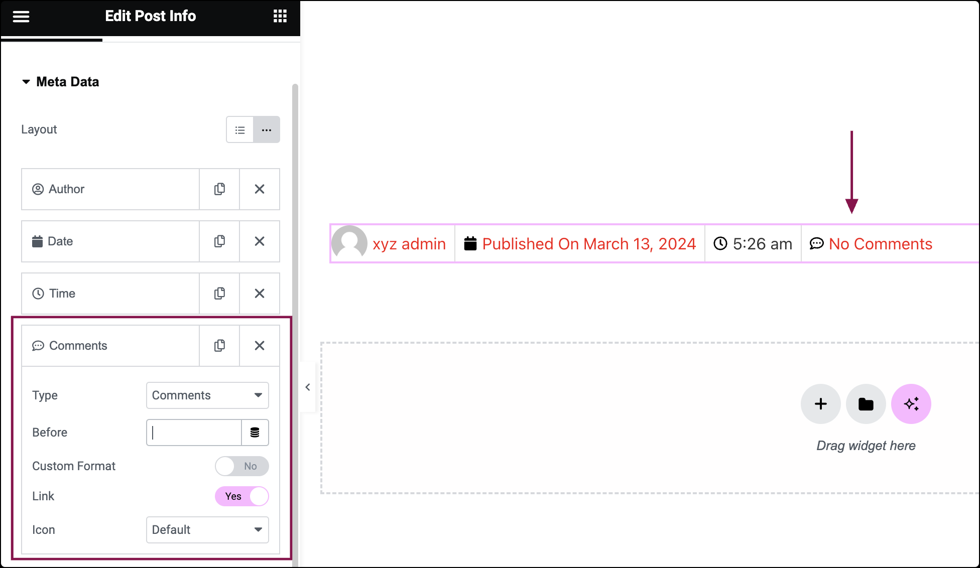
- For Comments meta:
- In the Type field, from the drop-down menu, change the type of item from Comments to Author, Date, Time, Terms, or Custom.
- In the Before field, enter the text to be displayed before the Comments.
- Slide the Custom Format toggle to YES to change the phrasing for No Comments, One Comment, etc.
- Slide the Link toggle to YES to link the comment form to the current post.
- In the Icon field, select an icon for the meta item. Choose None, Default, or Custom.
- For Terms meta:
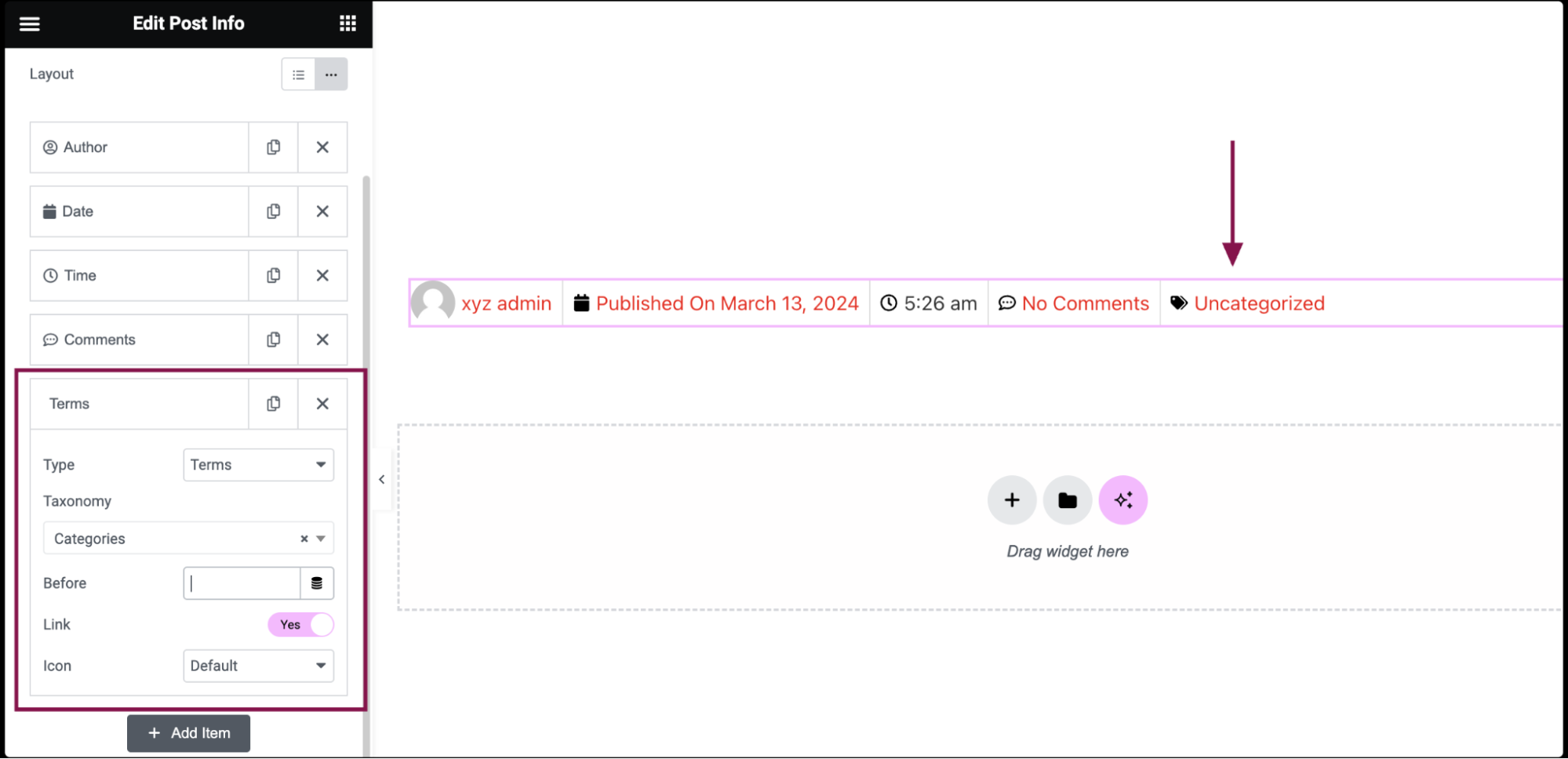
- In the Type field, from the drop-down menu, choose Terms.
- In the Taxonomy field, from the drop-down, choose to display specific taxonomy information related to posts, such as Categories or Tags.
- In the Before field, add text to be displayed before the term.
- Slide the Link toggle to YES to link the term to its archive page.
- In the Icon field, select an icon for the meta item. Choose None, Default, or Custom.
- For Custom meta:
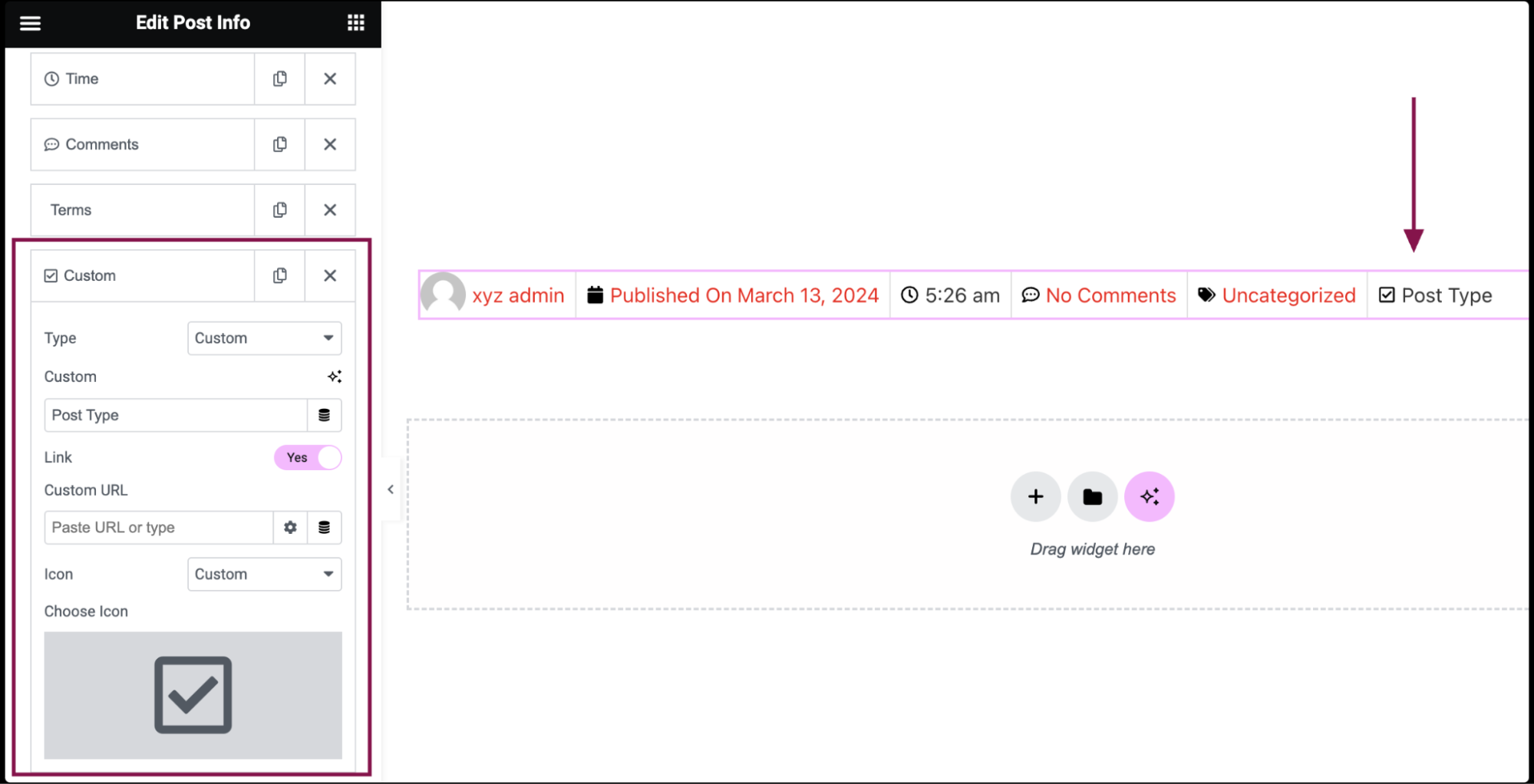
- In the Type field, from the drop-down menu, choose Custom.
- In the Custom field, add custom text.
- Slide the Link toggle to YES to make the custom meta clickable.
- In the Custom URL field, add a custom URL.
- In the Icon field, select an icon for the meta item. Choose None, Default, or Custom.
You can customize your widgets using content, style, and other advanced parameters, offering you great flexibility in tailoring them to your needs. Click the tabs below to see all the settings available for this widget.
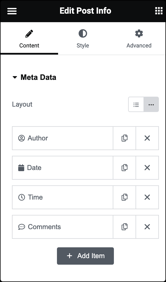
In the Content tab, you can choose the meta data type, and further customize its settings.
Layout
Choose between Default and Inline layout.
Below the Layout option, you’ll find a list of all available meta data:
- Drag and drop them to change their order.
- Click on the Add Item button to add a custom post info meta item to the list.
- To duplicate or delete items, click on the item’s Duplicate or Delete
 icon.
icon. - Select each meta item to access its settings. The default meta items include Author, Date, Time, and Comments. You can add additional items such as Terms and Custom. Each meta item has different customization options.
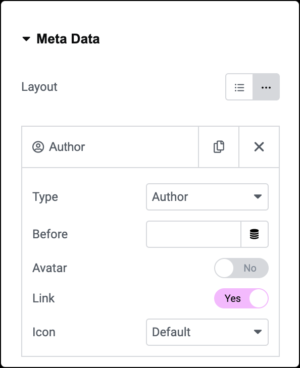
Type
Choose Author meta.
Before
Specify the text that appears before the author’s name.
Avatar
Choose whether to display the author’s avatar (profile picture).
Link
Decide whether to link the author’s name to their archive page, where visitors can see all posts written by that author.
Icon
Select None, Default, or a Custom icon from the Icon Library.
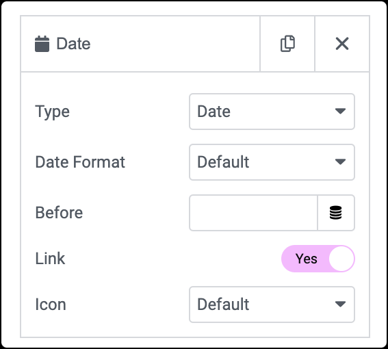
Type
Choose Date meta.
Date Format
Customize the date format to display the publication date of the post.
Before
Add text before the date.
Link
Choose whether to link the date to the post’s archive.
Icon
Select None, Default, or a Custom icon from the Icon Library.
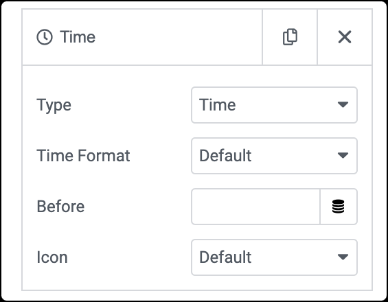
Type
Choose Time meta.
Time Format
Customize the time format.
Before
Add text before the time.
Icon
Display an icon.
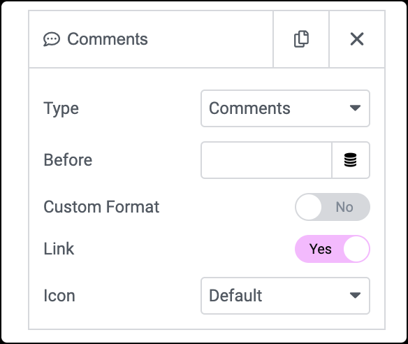
Type
Choose Comments meta.
Before
Customize the text displayed before the number of comments.
Custom Format
Modify the phrasing for different comment counts (e.g., “No Comments”, “One Comment”, “2 Comments”).
Link
Choose whether the link to the comment form for the current post.
Icon
Select None, Default, or a Custom icon from the Icon Library.
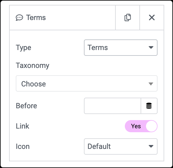
Type
Choose Terms meta.
Taxonomy
Display specific taxonomy information related to your posts, such as categories or tags.
Before
Add text before the term.
Link
Decide whether to link it to its archive page.
Icon
Select an icon.
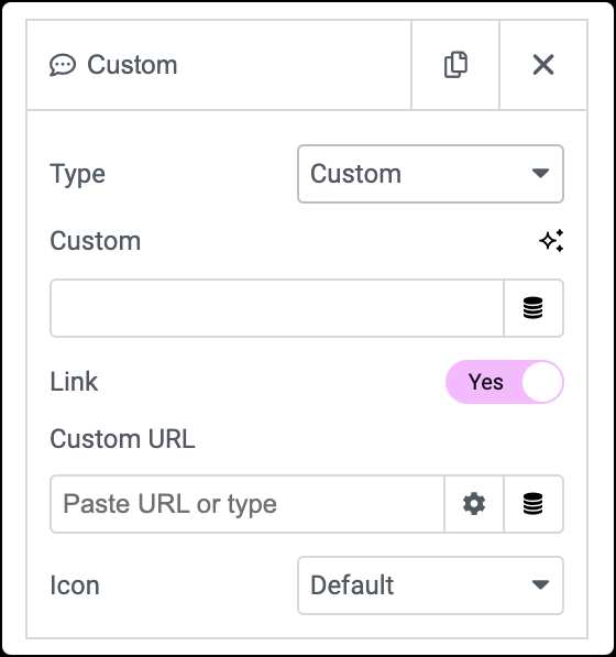
Type
Choose Custom meta.
Custom
Input custom text.
Link
Enable link toggle.
Custom URL
Specify a custom URL.
Icon
Choose an icon.
In the Style tab, you get options to adjust alignment, customize typography, choose color, and more.
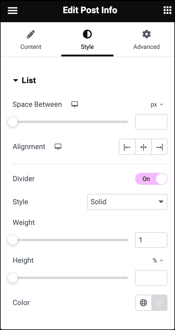
Space Between
Adjust the space between each post info item.
Alignment
Align the list of post info items left, center, or right.
Divider
Set ON to add a divider line between each post info item.
If the Divider is set to ON, the following options become available:
- Style: Select solid, double, dotted, or dashed.
- Weight: Set the divider’s weight.
- Height: Set the divider’s height.
- Color: Choose the divider’s color.
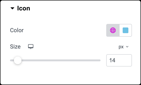
Color
Choose the color of the post info icon.
Size
Set the size of the post info icon.
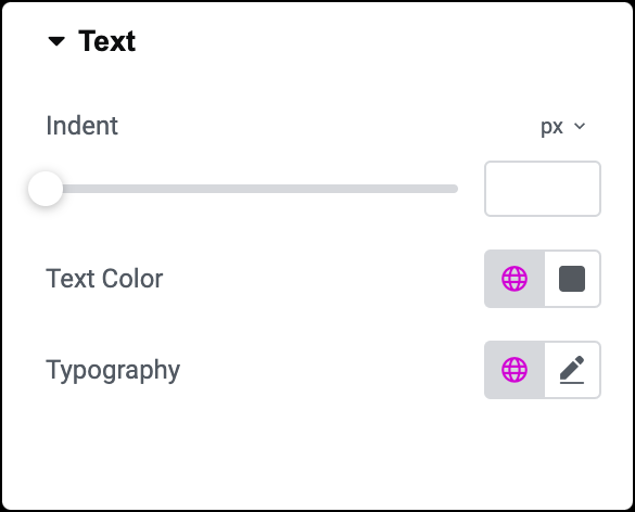
Indent
Set the amount of space the text is indented from the icon.
Text Color
Choose the color of the text.
Typography
Set the typography options for the text. Learn more about Typography.
The Advanced tab provides options to control widget position, adjust spacing, add custom code, and more.
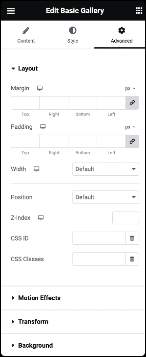
Advanced
Learn more about the Advanced tab settings.