
Add the widget to the canvas
- In Elementor Editor, click +.
All available widgets are displayed. - Click or drag the widget to the canvas. For more information, see Add elements to a page.
The Post widget allows you to display a list of blog posts or any custom post types on your website. It automatically pulls in posts from the WordPress database and presents them in a specified layout and format.
The Posts widget offers plenty of customization options allowing you to choose how your posts are displayed. You can customize the appearance of each post, including the title, featured image, excerpt, and more.
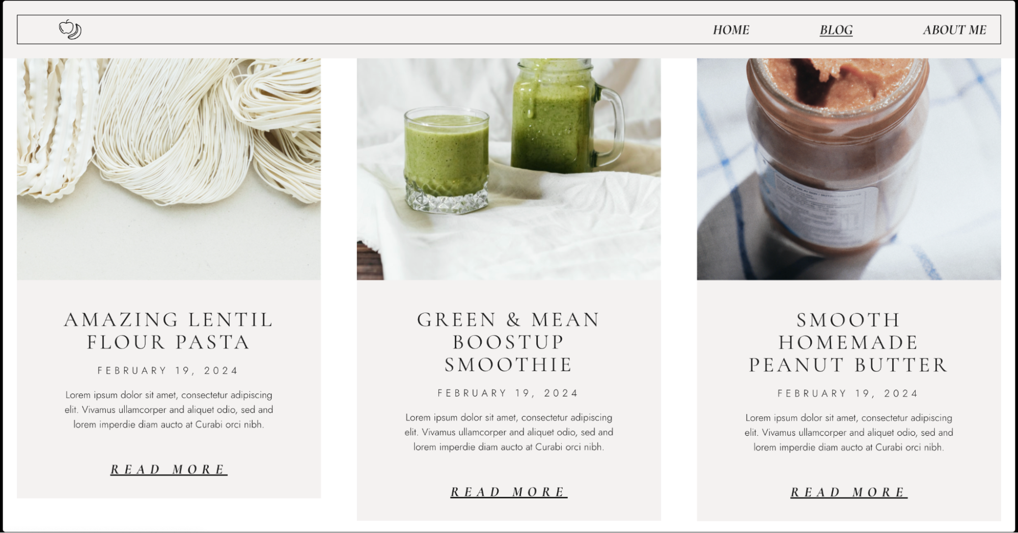
Alex is a food blogger and is building a website where they can share delicious recipes and culinary tips. Alex wants to create a dedicated page that allows his visitors to explore and discover their extensive collection of recipes easily. To achieve this, Alex uses the Posts widget.
Alex designs a beautiful recipe blog on his homepage & displays their dishes in a gorgeous classic grid layout with compelling images and brief descriptions. Visitors on Alex’s website can easily browse through recipes, click on their favorites, and access detailed instructions and ingredient lists.
- Displaying recent news articles on a news website homepage.
- Highlighting upcoming events on an event management website.
- Featuring portfolio projects on a freelancer’s website.
- Displaying real estate listings on a property management website.
- Add the Posts widget to the canvas. For details, see Add elements to a page.
- In the Content tab, under the Layout section, select the Skin best suited for your web page design. You have three options to choose from: Classic, Card and Full Content.
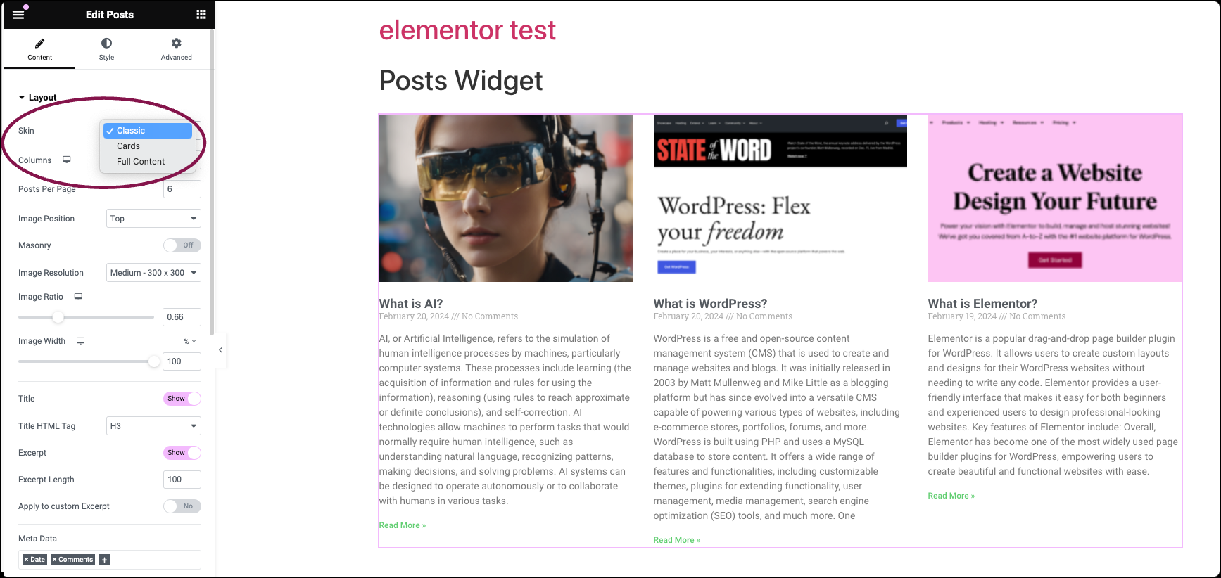 The options in the layout section vary based on the skin type you choose.
- Classic Skin: Offers a customizable traditional design for posts. You can set Columns, Posts Per Page, Image Position, enable Masonry layout, set Image Resolution, Title display, Excerpt Length, Meta Data display, Read More button, and more.
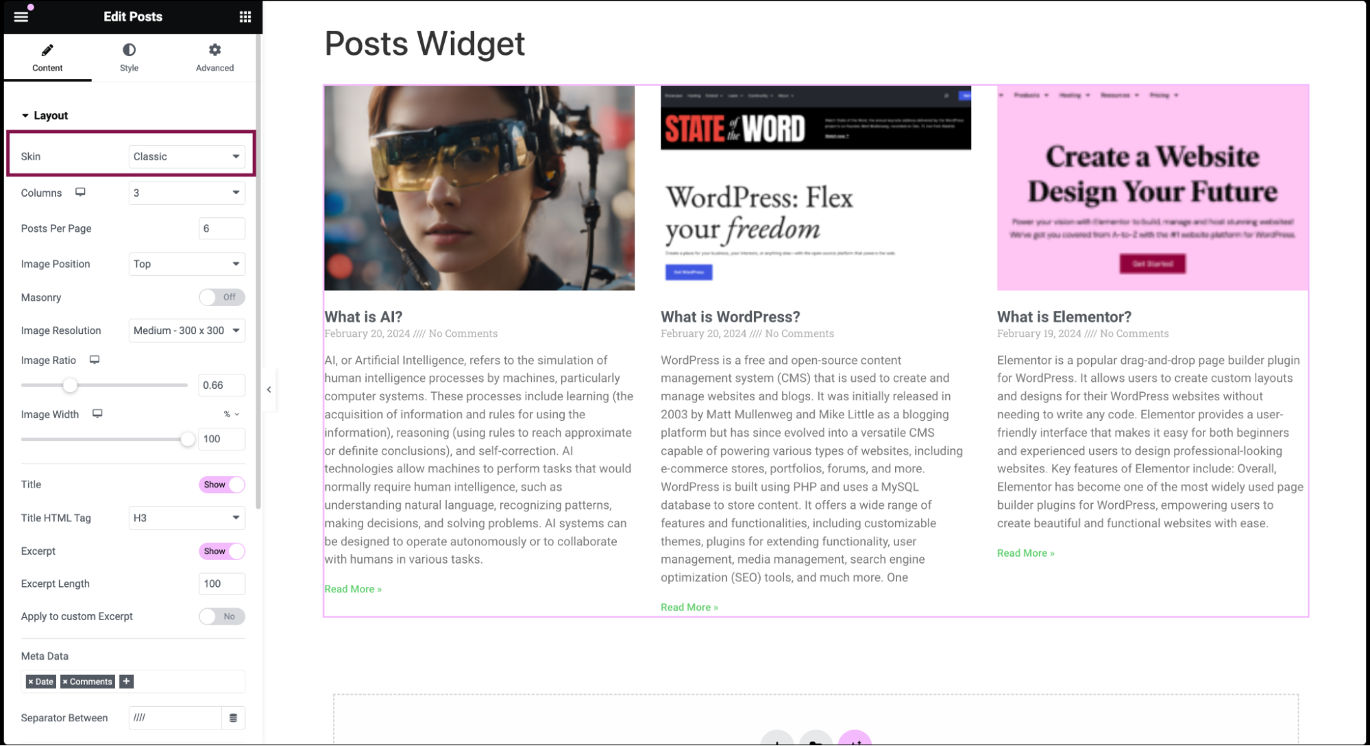
- Cards Skin: Provides a trendy material design style for posts. Users can set Columns, Posts Per Page, Featured Image display, enable Masonry layout, define Image Resolution, Title display, Excerpt Length, Meta Data display, Read More button, Badge Display, Avatar Display, and more.
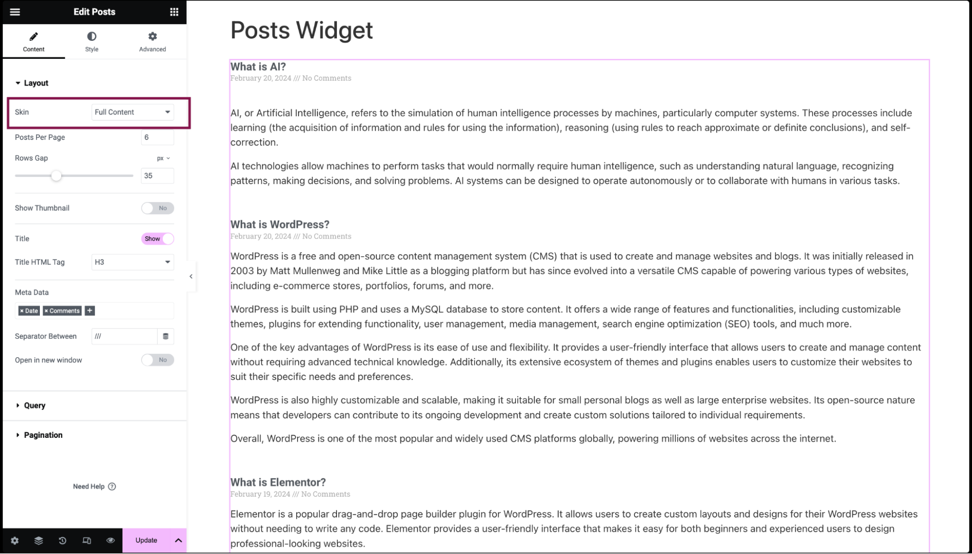
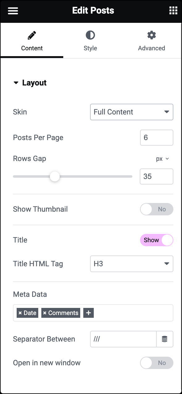
- Full Content Skin: Displays the entire post content on post list pages. You can set Posts Per Page, Featured Image display, Image Resolution, Title display, Meta Data display, and Open Posts in New Tab option.
- Classic Skin: Offers a customizable traditional design for posts. You can set Columns, Posts Per Page, Image Position, enable Masonry layout, set Image Resolution, Title display, Excerpt Length, Meta Data display, Read More button, and more.
- Under the Query section, choose the Source from which the widget gets its content from. You can choose from options like Posts, Pages, Landing Pages, Custom post types (if available), Manual Selection, Current Query, and Related.Depending on the source you pick, you can Include/Exclude posts based on the different parameters:
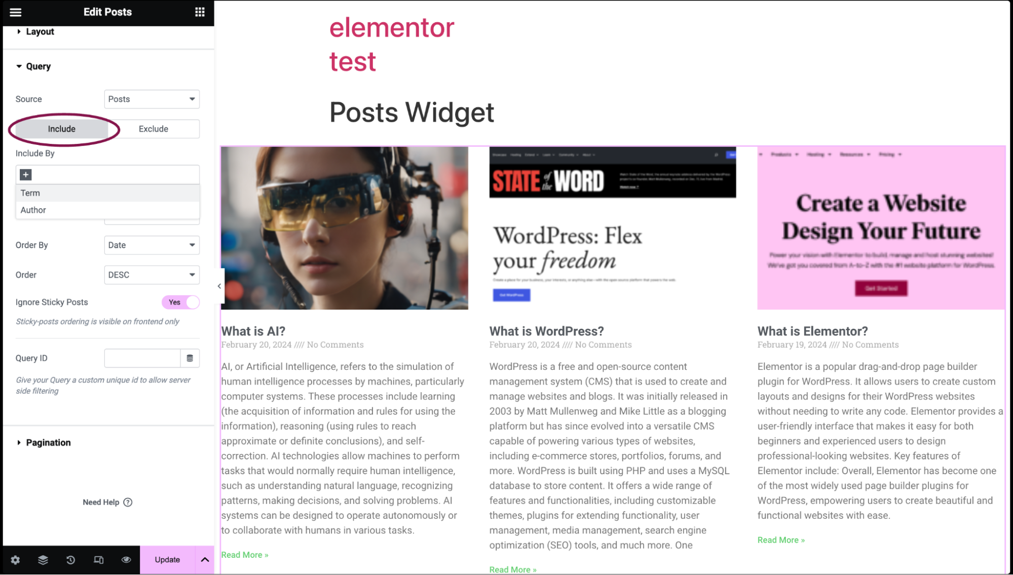
Include
- Include By: Select either Term or Author, then search and select the specific items.
- Date: Filter posts by time frame (e.g., Past Day, Past Week, Custom).
- Order By: Set the order of the post display. Options include Date, Title, Menu Order, or Random.
- Order: Choose between descending (DESC) or ascending (ASC) order.
- Ignore Sticky Posts: Decide whether to include sticky posts in the results.
- Query ID: Assign a unique custom ID to your Query to enable server-side filtering. You can input the ID manually into a designated field or use Dynamic Tags to automatically populate with relevant data.
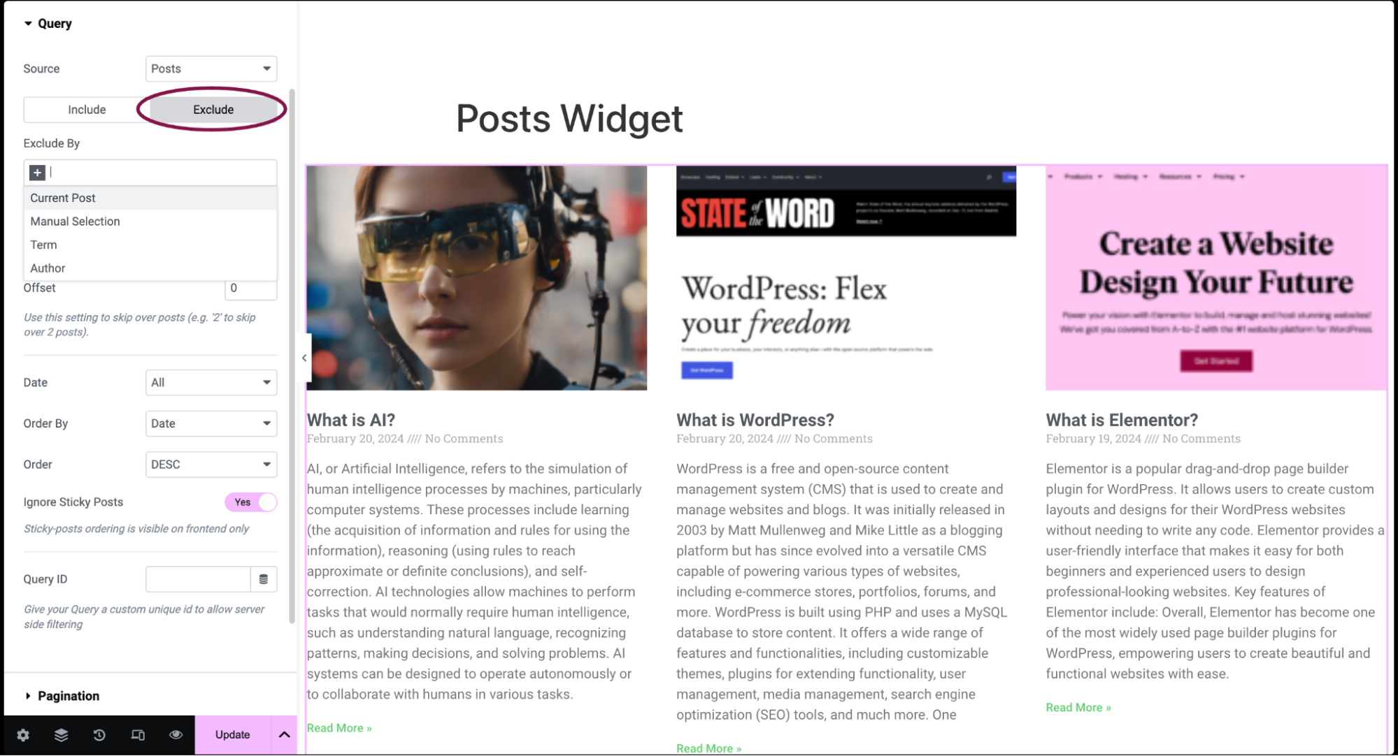
Exclude
- Exclude By: Specify criteria for excluding posts (e.g., Current Post, Manual Selection, Term, Author).
- Avoid Duplicates: Choose whether to prevent duplicate posts from displaying on the front end. Elementor looks for duplicates at the page level (not at the widget level) given that there cannot be duplicates in a Posts widget.
- Offset: Skip over a certain number of posts. For example, setting it to 2 would skip the first 2 posts.
- Date: Filter posts based on time frame. Options include All, Past Day, Past Week, Past Month, Past Quarter, Past Year, Custom (Choose Before or After dates)
- Order By: Set the order for excluded posts.
- Order: Choose between descending or ascending order.
- Ignore Sticky Posts: Decide whether to include sticky posts in the excluded results.
- Query ID: Give your Query a custom unique ID to allow server-side filtering. See the developer docs for more information on how to use this advanced feature.
 NoteIf you choose Related as the source and Category as the Include By term, the widget will display posts that are related to the category assigned to the post currently being viewed. For example, if a user is reading a post in the Travel category, the page will show related posts that are also categorized under Travel. If the current post has multiple categories assigned to it, the related posts will be pulled from the first category listed alphabetically.
But if you set a Fallback for Related Posts, it won’t work according to the mentioned query. Instead, it will display the content specified as the fallback. This could be the Recent Posts or any other post type manually selected by you.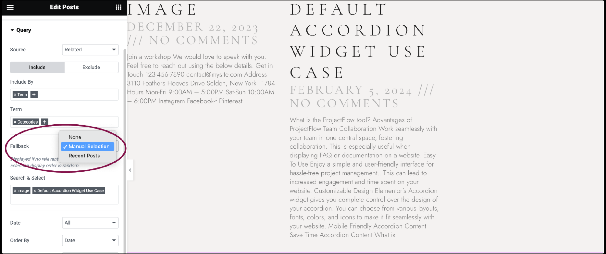
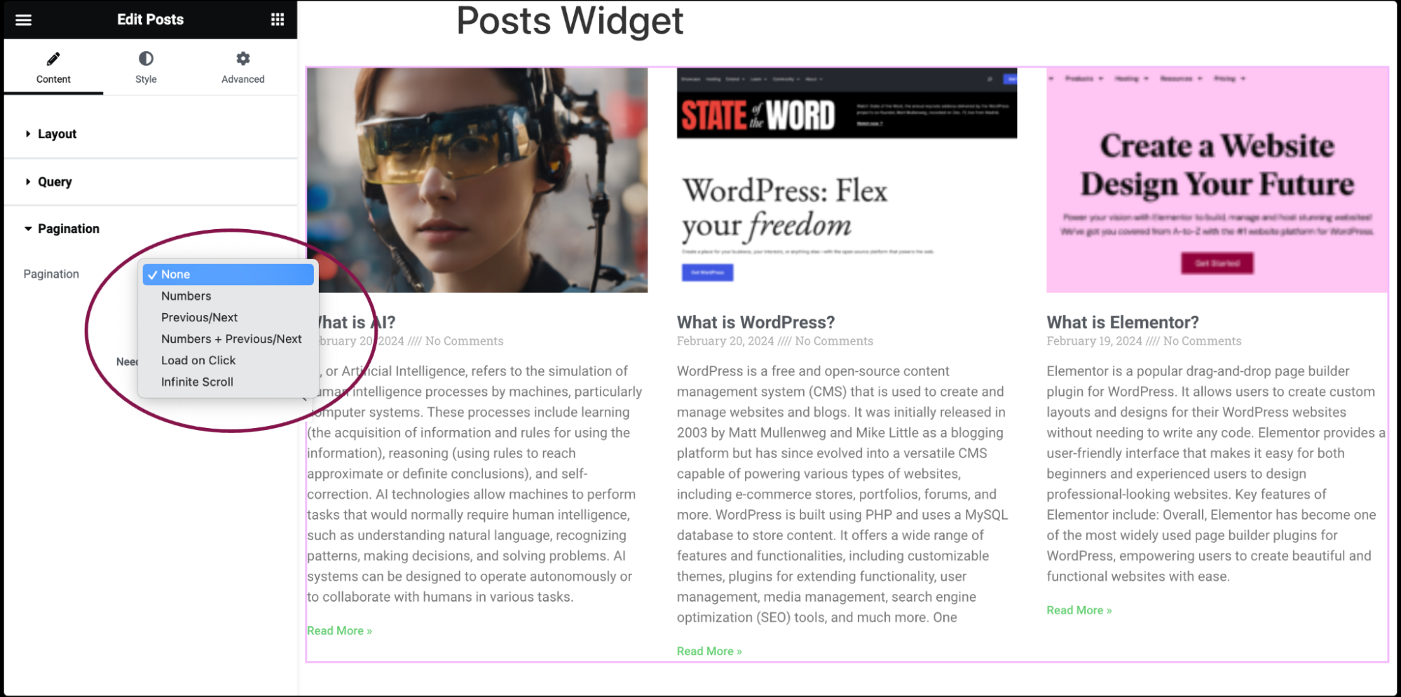
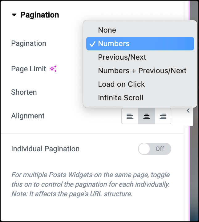
- In the Pagination section, choose the pagination type for posts. Options available are: None, Numbers, Previous/Next, Numbers + Previous/Next, Load On Click, or Infinite Scroll.
You can customize your widgets using content, style, and other advanced parameters, offering you great flexibility in tailoring them to your needs. Click the tabs below to see all the settings available for this widget.

Skin
Choose Classic.
Note: You can choose from three Skin options: Classic, Card, and Full Content. Customization options in the content tab will vary based on the skin type you select.
Columns
Set how many columns will be displayed from 1 to 6.
Posts Per Page
Set the exact amount of posts displayed.
Image Position
Set the image position, relative to the content. Options include: Top / left / right / none.
Masonry
Slide on or off.
Image Resolution
Set the size of the image, from thumbnail to full.
Image Ratio
Set the exact ratio of the images.
Image Width
Set the exact width of the images.
Title
Choose to show or hide the post title.
Title HTML Tag
Select the HTML tag to use for the title, from H1 to H6, or div, span, or p.
Excerpt
Choose to show or hide the excerpt.
Excerpt Length
Choose the length of the excerpt, setting the exact amount of words displayed.
Apply to custom Excerpt
When toggled, this will override the length of the manual excerpt written in the WP editor.
Meta Data
Select the meta data to be displayed in the widget. A click on the field opens the list of options. The options include author, date, time, and comments.
Separator Between
Choose the separator you want to use between the meta data.
Read More
Show or hide the Read More button.
Read More Text
Customize the Read More text You may also use the Dynamic Tags feature to call from the site’s metadata or custom field.
Automatically align buttons
Slide to Yes to align the Read More button to the bottom of the wrapper. This is useful when the post titles exceed more than one line.
Open in new window
Slide to Yes if you wish posts to open in a new tab.

Skin
Choose Cards.
Note: You can choose from three Skin options: Classic, Card, and Full Content. Customization options in the content tab will vary based on the skin type you select.
Columns
Choose how many columns you want your posts to be displayed in, from 1 to 6.
Posts Per page
Decide how many posts you want to show on each page
Show Image Position
Toggle to display or hide the main/featured image associated with each post
Masonry
Toggle to enable or disable a masonry layout, which adjusts the positioning of elements to fit together neatly.
Image Resolution
Select the size of the images to be displayed, from small thumbnails to full-size images.
Image Ratio
Set the exact shape of the images.
Title
Choose whether to display or hide the title of each post.
Title HTML Tag
Choose the type of HTML tag to use for the title, like headings (H1 to H6) or other inline tags (div, span, p).
Excerpt
Decide whether to show or hide a short summary of each post.
Excerpt Length
Set the number of words to be displayed in the excerpt.
Apply to custom Excerpt
When enabled, this overrides any manual excerpt written in the WordPress editor.
Meta Data
Select which additional information to display with each post, like the author’s name, publication date, time, or comments.
Read More
Toggle to show or hide a button that leads readers to the full post.
Read More Text
Customize the text on the Read More button. You may also use the Dynamic Tags feature to call from the site’s metadata or custom field.
Open in new window
Enable this option to adjust the position of the Read More button to ensure it aligns neatly.
Badge
Decide whether posts should open in a new browser tab when clicked.
Badge Taxonomy
Choose whether to display a badge showing additional information like the post’s category or tags.
Avatar
Decide whether to show or hide the profile picture of the post’s author.
Skin
Choose Full Content.
Note: You can choose from three Skin options: Classic, Card, and Full Content. Customization options in the content tab will vary based on the skin type you select.
Posts Per Page
Decide how many posts you want to see on each page.
Rows Gap
Choose whether to display the featured image with each post, with options Yes or No.
Show Thumbnail
Set the size of the featured image, from a small thumbnail to the full image size.
Image Resolution
Set the size of the featured image, from a small thumbnail to the full image size.
Image Ratio
Set the exact shape of the featured image.
Image Width
Adjust the width of the featured image.
Title
Decide whether to display the title of each post.
Title HTML Tag
Choose the HTML tag to format the title, like H1 to H6, or other options like div, span, or p.
Meta Data
Select which additional information to display with each post, such as author, date, time, or comments.
Separator Between
Specify the character(s) you want to use to separate the meta data.
Open in new window
Toggle to choose whether posts should open in a new browser tab.
Source
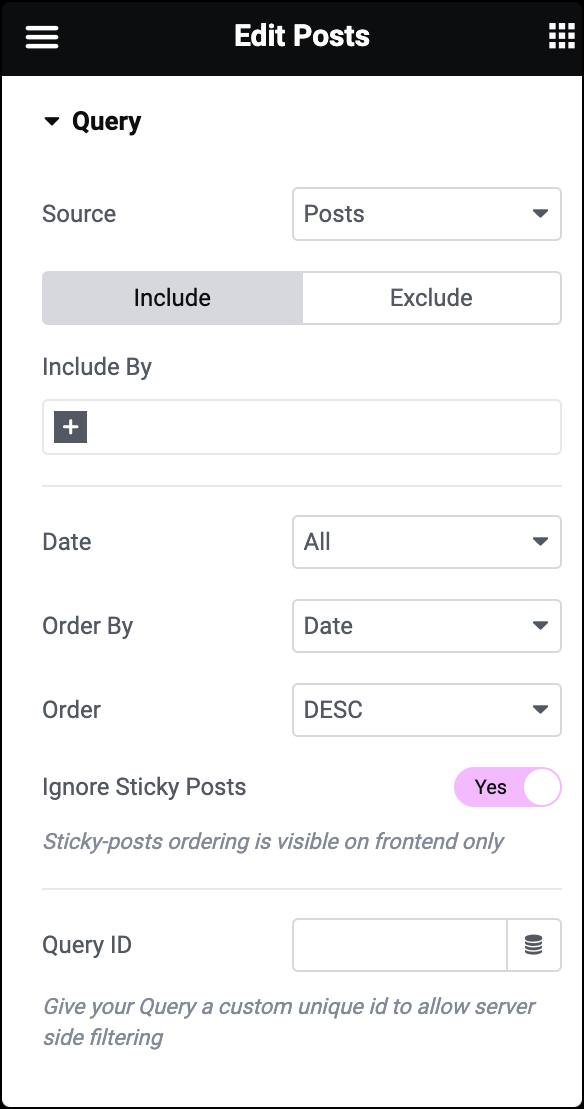
Choose where the widget gets its content from. Options include Posts, Pages, Custom post types, Manual Selection, Current Query, and Related. Depending on your choice, you’ll have filtering options.
Include
Select specific posts or pages to include in the widget. You can filter by term or author. Available taxonomies for terms include categories, tags, formats, and custom taxonomies. You can also filter by date, choosing from options like Past Day, Past Week, etc., or set a custom date range.
Exclude
Choose criteria to exclude certain posts. Options include Current Post, Manual Selection, Term, or Author. You can manually select posts, terms, or authors to exclude.
Pagination
- Page Limit: Set the number of posts to display per page.
- Previous Label: Customize the text for the previous button.
- Next Label: Customize the text for the next button.
- Alignment: Choose the alignment of pagination controls.
If choose: Numbers
- Page Limit: Set the number of posts to display per page.
- Shorten: Toggle to shorten the display if needed.
- Alignment: Choose the alignment of pagination controls (Right, Center, Left).
If choose: Previous / Next
- Page Limit: Set the number of posts to display per page.
- Previous Label: Customize the text for the previous button.
- Next Label: Customize the text for the next button.
- Alignment: Choose the alignment of pagination controls.
If choose: Numbers + Previous / Next
- Page Limit: Set the number of posts to display per page.
- Previous Label: Customize the text for the previous button.
- Next Label: Customize the text for the next button.
- Shorten: Toggle to shorten the display if needed.
- Alignment: Choose the alignment of pagination controls.
If choose: Load On Click
- Spinner: Choose to display a loading spinner.
- Button Text: Set the text for the load more button.
- Alignment: Choose the alignment of the load more button.
- Icon: Choose an icon for the button.
- Icon Spacing: Adjust the spacing around the icon.
- Button ID: Assign a unique button I, which is helpful for situations like Google Analytics events.
If choose: Infinite Scroll
- Spinner: Choose to display a loading spinner.
- No More Posts Message: Add a custom message and choose alignment.
Individual Pagination
Allows you to control pagination individually for multiple Posts Widgets on the same page. When enabled, each widget will have its own pagination settings.
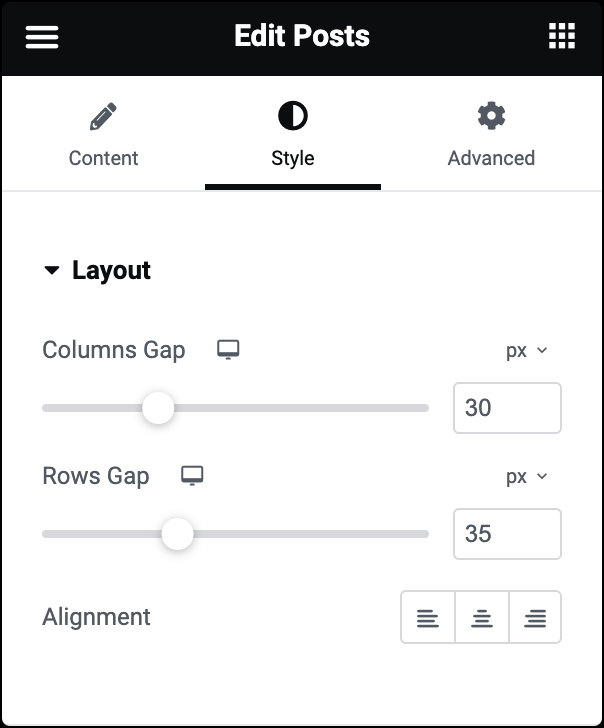
Columns Gap
Use the slider to adjust the spacing between columns.
Rows Gap
Use the slider to set the spacing between rows.
Alignment
Specifies how the widget is aligned within its container. You can choose from options like left, center, or right alignment.
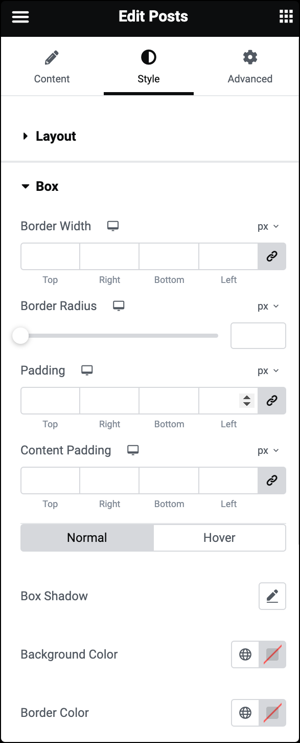
Box [Classic Skin]
- Border Width: Adjust the thickness of the border around the box.
- Border Radius: Set how round the corners of the border should be. For more details, see Border radius tools.
- Padding: Set the spacing inside the entire box.
- Content Padding: Adjust the spacing inside just the box’s content.
- Box Shadow: Apply a predefined box shadow effect to the box.
- Background Color: Choose colors for the box in its normal and hover states.
- Border Color: Select colors for the box’s border in its normal and hover states.
Card [Cards Skin]
- Background Color: Sets the background color. For more details, see Create a Background.
- Border Color: Determines the color of the border..
- Border Width: Adjusts the thickness of the border surrounding each card.
- Border Radius: Sets the roundness of the corners of each card.
- Horizontal Padding: This controls the spacing between the content and the left and right edges of the card.
- Vertical Padding: Similar to horizontal padding, this controls the spacing between the content and the top and bottom edges of the card.
- Box Shadow: Adds a shadow effect. Learn more about shadows.
- Hover Effect: Enable the effect that occurs when a user hovers their cursor over the card.
- Meta Border Color: Specifies the color of the border around metadata (such as author name, date, etc.)
Box [Full Content Skin]
- Border Width: Adjust the thickness of the border around the box.
- Border Radius: Set how round the corners of the border should be.
- Padding: Set the spacing inside the entire box.
- Content Padding: Adjust the spacing inside just the box’s content.
- Box Shadow: Apply a predefined box shadow effect to the box.
- Background Color: Choose colors for the box in its normal and hover states.
- Border Color: Select colors for the box’s border in its normal and hover states
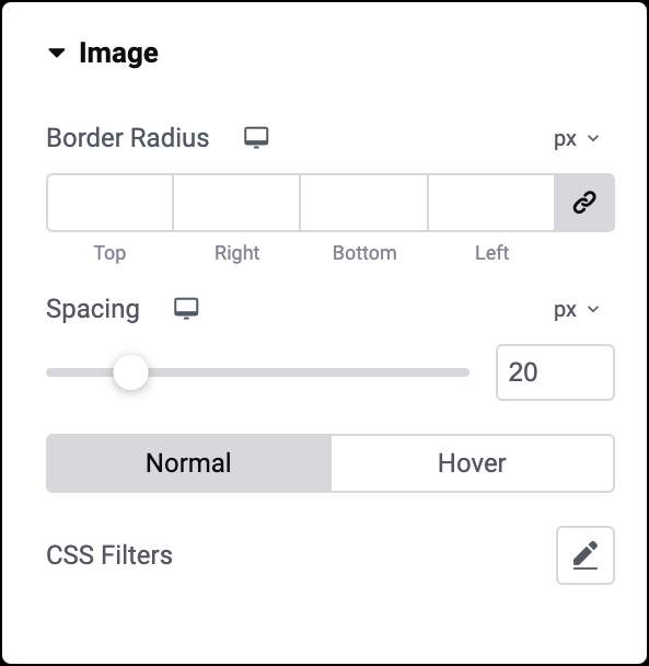
Border Radius
Set the roundness of the corners for the featured image.
Spacing
Adjust the space between the featured image and the content.
CSS Filters
Change the style of the featured image using CSS filter scales for Blur, Brightness, Contrast, Saturation, and Hue settings.
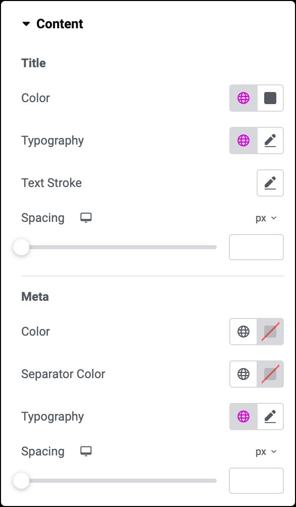
Title
- Color: Choose the color of the titles.
- Typography: Set the font style for the titles. For more details, see Typography.
- Spacing: Adjust the space between the title and the content.
Meta
- Color: Set the color of the metadata.
- Separator Color: Choose the color of the separator between metadata items.
- Typography: Set the font style for the metadata.
- Spacing: Adjust the space between the metadata and the excerpt.
Typography
Choose font family, size, and styles. For more details, see Typography.
Colors
Set colors for Normal, Hover, and Active states.
Space Between
Adjust the space between pagination elements.
Spacing
Adjust overall spacing.
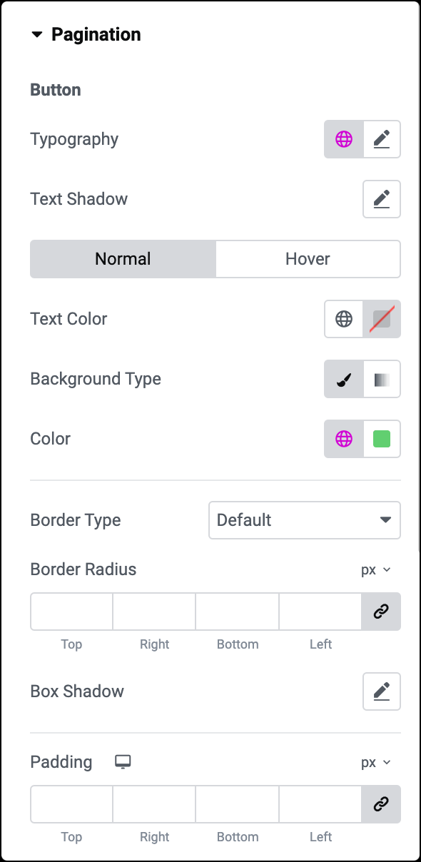
Button (if Load on Click is selected)
- Typography: Set font style for the button text.
- Text Shadow: Apply a shadow effect to the button text.
- Text Color: Set font color for normal and hover states.
- Background Type: Choose between a solid color or gradient for the button background.
- Border Style: Select border type, width, color, and radius. For more details, see Border type.
- Box Shadow: Apply shadow to the button.
- Padding: Adjust the padding of the button.
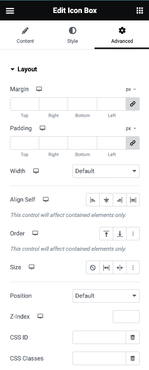
The Advanced tab provides options to control widget position, adjust spacing, add custom code, and more.
Advanced
Learn more about the Advanced tab settings.