Add the widget to the canvas
To access and use a widget:
In Elementor Editor, click +.
All available widgets are displayed.Click or drag the widget to the canvas. For more information, see Add elements to a page.
The Slides widget allows you to create and customize slide presentations or carousels directly within your WordPress website.
With this widget, you can easily showcase images, content, or any other media in a list of slides. It’s a popular feature for creating sliders, testimonials, product showcases, and more.
Ana is a blogger & looking for a creative way to feature a series of articles on their website’s front page. They then designed an engaging carousel that displayed featured images and titles of her latest posts. This makes it easy for visitors to see content and encourages them to read more articles, keeping them on the site longer.
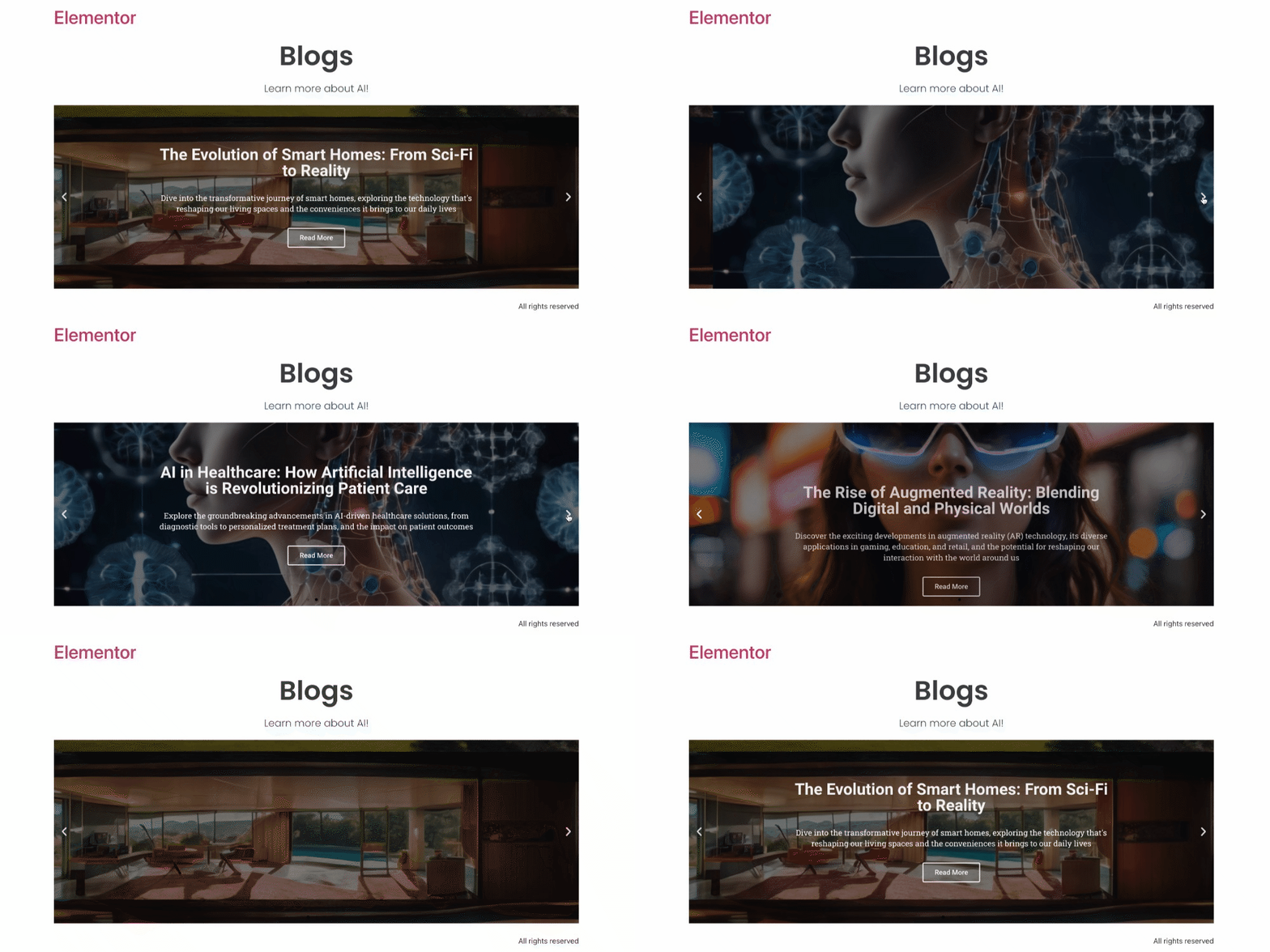
- Highlighting key services offered by a business.
- Showcasing customer reviews and ratings.
- Displaying a portfolio of graphic design projects.
- Presenting a timeline of company milestones.
- Add the Slides widget to the canvas. For details, see Add elements to a page.
- In the Content tab, under the Slides section, you’ll find the list of slides. You can rearrange the slides using drag-and-drop, as well as duplicate, remove, or add new slides. Clicking on the individual slide displays its specific settings. Within each slide, you can customize its Background, Content, and Styling.
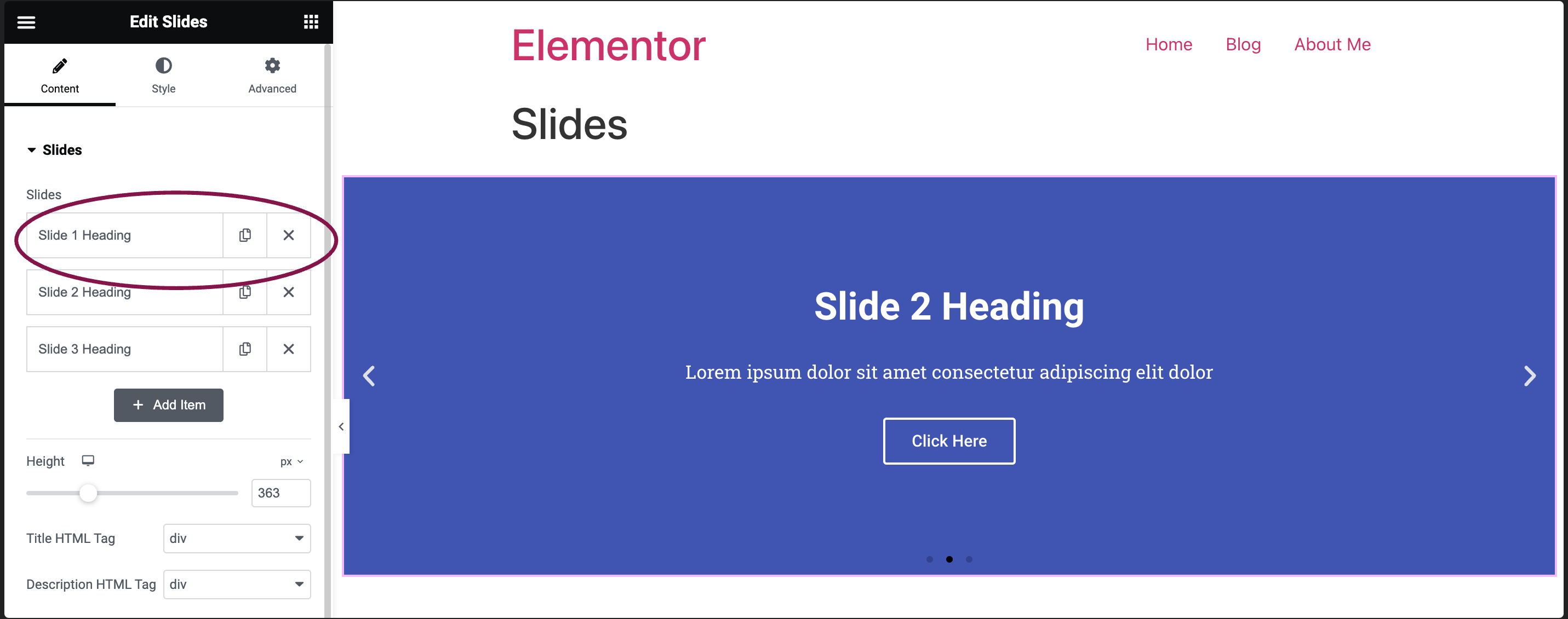
Background Sub-Tab
- In the Background field, select the background type for the slides. You can pick a solid color of your choice, or add an image from your media library.
- Click on the Color tab to pick a background color.
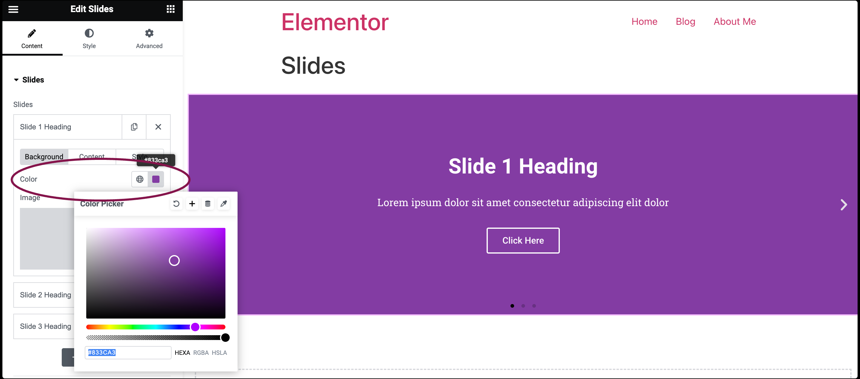
- Click the + icon under the Image tab to choose a picture from your site’s media library.
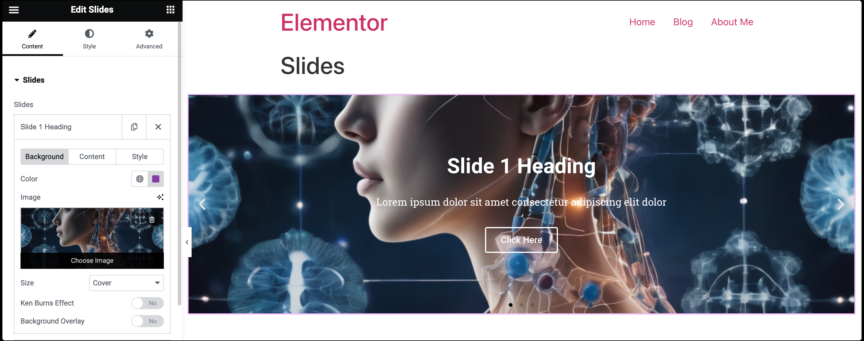
If you choose an image as a background, you’ll find extra image customization features:
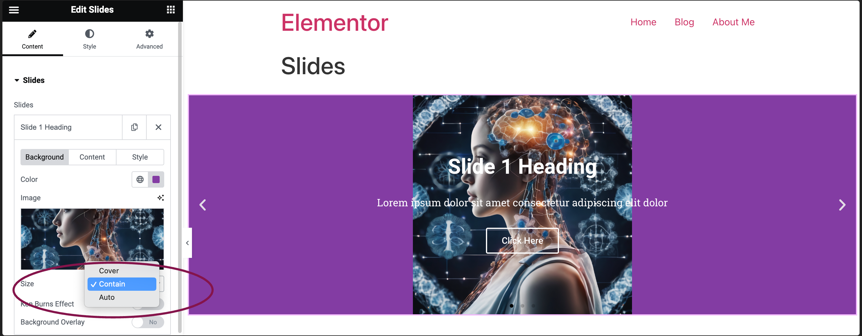
- Size: Decide how the background image should be showcased. You can choose from three options: Auto, Cover and Contain.
- Cover: When an image is set to Cover, it means the image will scale to cover the entire area of its slide while maintaining its aspect ratio. This might result in parts of the image being cropped if the slides’s aspect ratio doesn’t match that of your image. This option is ideal for more abstract and atmospheric images, where the showing of the entire image is less important.
- Contain: With Contain, the entire image is displayed within the slide, ensuring the image’s entire content is visible. This method scales the image so that it fits entirely inside the container, again maintaining its aspect ratio. This option works best if you want the entire image to appear in the slider.
- Auto: The Auto options allow the browser or software to choose the most appropriate scaling method based on the slide’s size and the image’s aspect ratio.
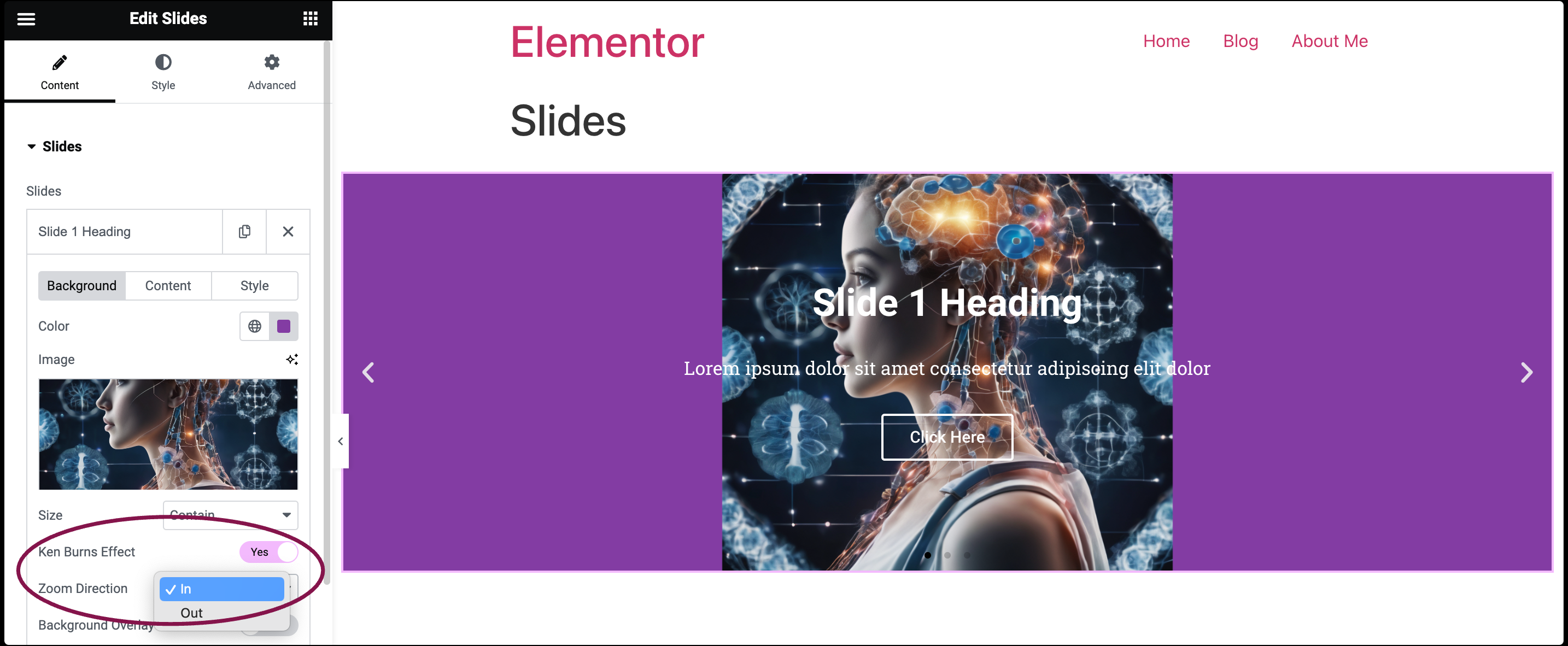
- Ken Burns Effect: Toggle to Yes to activate this trendy zoom effect for a dynamic touch to your background image. If you set it to yes, you can also pick if the Zoom Direction goes In or Out.
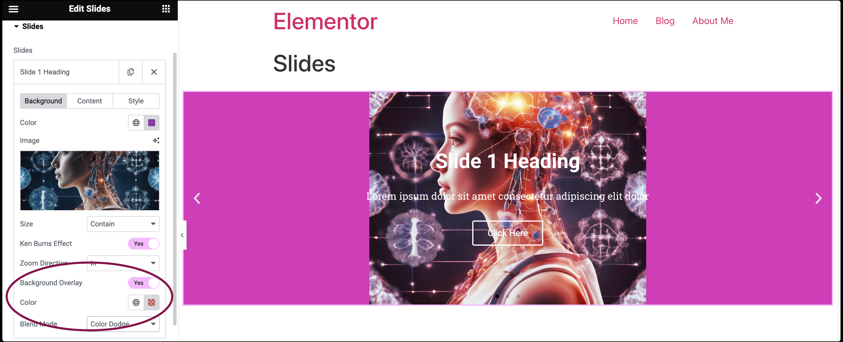
- Overlay: Toggle to Yes to add a colored layer over the image for style. If set to yes, you can further personalize the overlay by selecting your preferred Color and Blend Mode.
- Size: Decide how the background image should be showcased. You can choose from three options: Auto, Cover and Contain.
- Click on the Color tab to pick a background color.
Content Sub-Tab
- In the Content field, you get options to add text content such as title, description, and button link for the slides. Plus, you can use Dynamic Tags to fill in content details to the slide automatically.
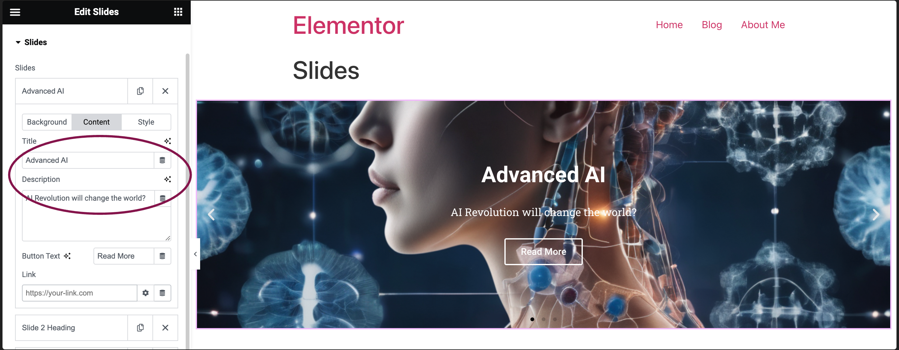
- In the Title tab, add the title for the slide.
- In the Description tab, add a brief description for the slide.
- In the Button Text field, define the text you want displayed on the button.
- In the Link field, add the URL where the slide or button should redirect users.
- Apply Link On: When you add a link, this choice shows up. You can choose if the link applies to only the Button or to the Whole Slide.
- Click the ⚙️ to set the link to either open in a new window or to add rel=nofollow to the link.
- Use the Custom Attributes option to assign custom attributes to the link element. Use the | (pipe) for key-value separation and commas to separate pairs.
Style Sub-Tab
- In the Style field, you can set a custom style that will only affect this specific slide you’re currently working on.
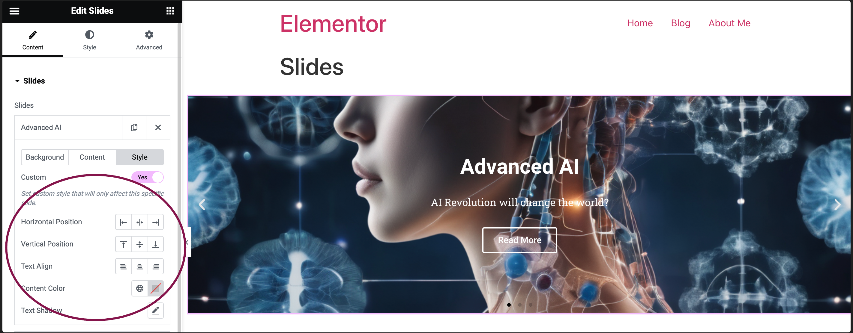
- Horizontal Position: Align the content to the left, right, or center.
- Vertical Position: Adjust the content’s placement to the top, middle, or bottom.
- Text Align: Determine the text alignment as left, center, or right.
- Content Color: Select the desired color for the slide content.
- Text Shadow: Click the 🖋️ icon to add a shadow to the title. Learn more about shadows.
You can customize your widgets using content, style, and other advanced parameters, offering you great flexibility in tailoring them to your needs. Click the tabs below to see all the settings available for this widget.
Using the options in the Content tab, you can input and customize textual elements such as titles, descriptions, and button links for individual slides. Additionally, it offers the flexibility to use dynamic tags for automatic content population, enhancing efficiency and consistency across slides.
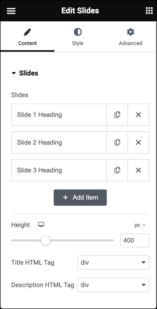
Slides
Shows the list of slides. You can drag and drop them to change their position, duplicate, delete, or add a slide. When you click on a single slide, its options open up. Each slide has Background, Content, and Style settings.
Background
- Color: Set the background color for the slide.
- Image: Choose an image from the media library. If an image is chosen as a slide background, you can adjust image Size, enable Kerns Burn Effect and Background Overlay.
Content
- Title: Insert the title for the slide.
- Description: Add a description for the slide.
- Button Text: Set the text for the button.
- Link: Add a URL the slide or button will link to. If a link is set, this option appears. Choose if the link applies to only the button or to the whole slide.
Style
Styling for individual tabs is OFF by default, relying on the global styles that are set on the widget’s Style tab. If you wish to override the global slide styles, turn the Custom switch to ON. This will enable you to set custom styles for that individual slide.
- Horizontal Position: Position the content horizontally: left, right, or center.
- Vertical Position: Position the content at the top, middle, or bottom.
- Text Align: Align the text left, center, or right.
- Content Color: Choose the color of the content.
- Text Shadow: Click the 🖋️ icon to add a shadow to the title. Learn more about Shadows.
Height
Use the Height field to adjust the height of the slides.
Title HTML Tag
In the Title HTML Tag field, use the dropdown menu to designate the title of the price list as a header (H1-6). This helps search engines find and understand the price list, boosting SEO. The title can also be tagged as a paragraph, span, or div.
Description HTML Tag
In the Description HTML Tag, use the dropdown menu to designate the description of the price list as a header (H1-6). This helps search engines find and understand the description, boosting SEO. The description can also be tagged as a paragraph, span, or div.
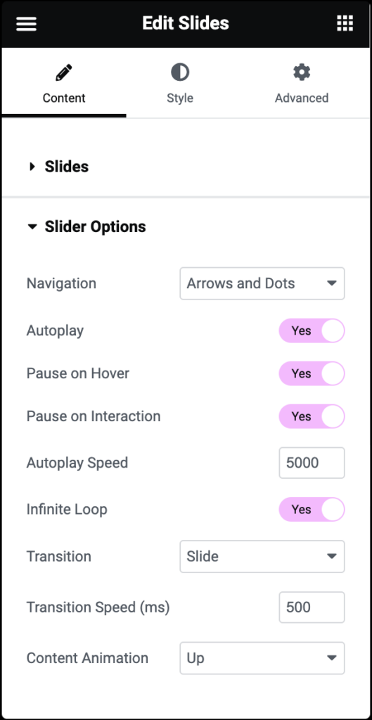
Navigation
Choose to display arrows, dots, both, or none.
Autoplay
Get the slides to rotate automatically according to the speed you set.
Pause on Hover
Make the slide pause when the mouse hovers over it.
Pause on Interaction
Determine if autoplay should pause when a user interacts with the slide.
Autoplay Speed
Set the time it takes for the slide to start rotating.
Infinite Loop
Make the slides rotate in an infinite loop without stopping.
Transition
Set the transition of the slides as slide or fade.
Transition Speed
Set the time it takes for the slides to rotate.
Content Animation
Set the animation effect of the content’s display when the slide is shown: None, Down, Up, Right, Left, or Zoom.
The Style tab provides options to customize the visual appearance of slides, including background settings, text alignment, content color, and slide height.
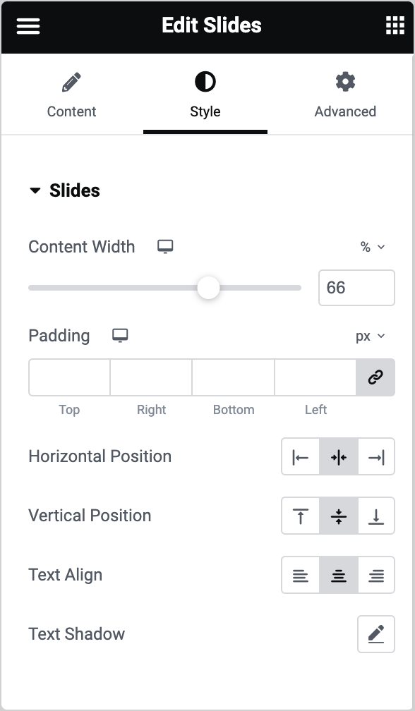
Content Width
Set the width of the content inside the slide.
Padding
Set the inner spacing between the edge of the content and the edge of the slide. Learn how to create space with padding and margins.
Horizontal Position
Set the position of the content as right, left, and center.
Vertical Position
Set the position of the content as top, middle, or bottom.
Text Align
Align the text to the right, left, or center.
Text Shadow
Add a shadow and blur to the text. Learn more about shadows.
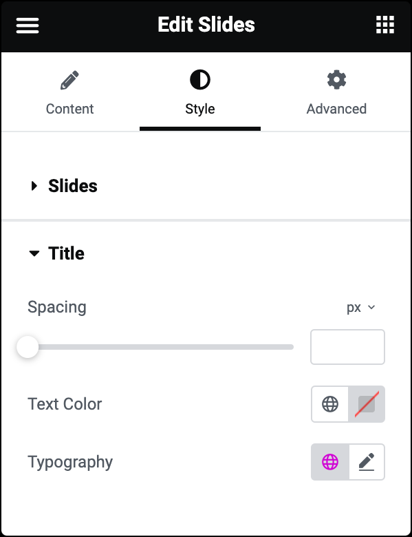
Spacing
Set the spacing between the title and the description.
Text Color
Set the color of the title.
Typography
Set the typography of the title.
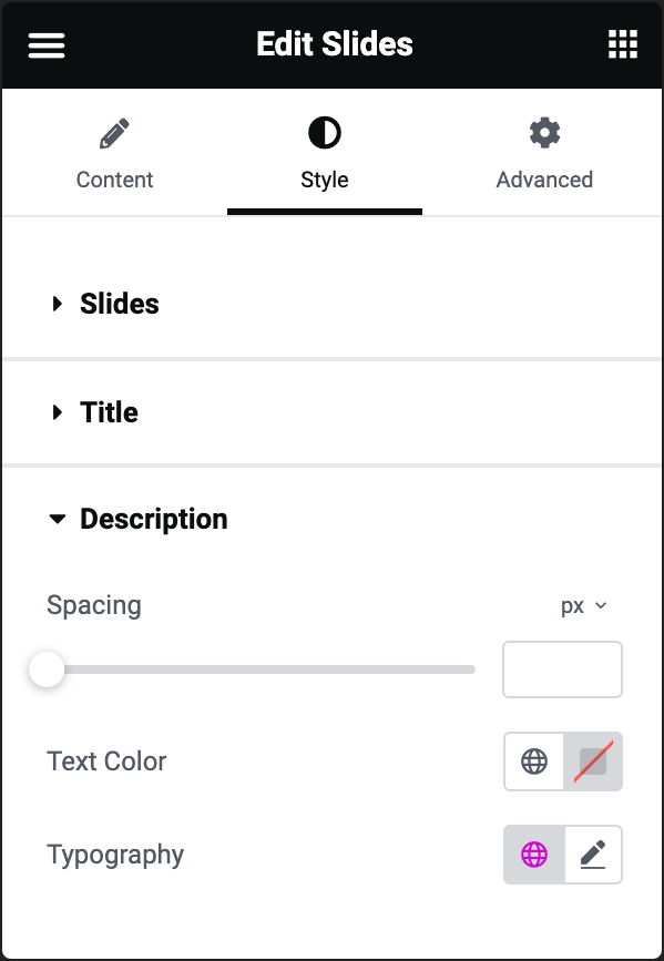
Spacing
Set the spacing between the description and the button.
Text Color
Set the color of the description.
Typography
Set the typography of the description. See more about Typography.
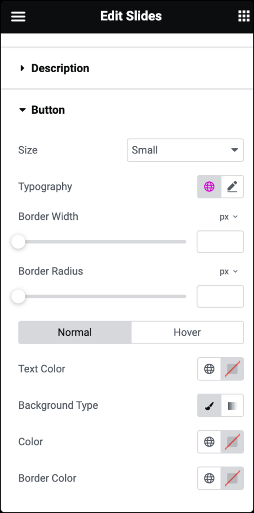
Size
Set the size of the button from extra small to extra large.
Typography
Set the typography of the button. Learn more about Typography.
Border Width
Set the border width of the button
Border Radius
Set the border radius to control corner roundness.
Normal / Hover
- Text Color: Set the text color.
- Background Type: Choose the background type of the button. Choose a Solid color or create a Gradient effect. Learn more about Gradient Backgrounds.
- Color: Set the background color of the button.
- Border Color: Set the border color of the button.
Hover mode lets you set a transition duration. This is the length of time it takes for the element to change its appearance.

Arrows
- Position: Set the position of the arrows inside or outside the slider.
- Size: Set the exact size of the arrows. Size can be in PX, EM, or REM. For more details about units of measurement, see Units of measurement.
- Color: Set the color of the arrows.
Pagination (Dots)
- Position: Set the position of the dots inside or outside the slider.
- Size: Set the exact size of the dots. Size can be in PX, EM, or REM. For more details about units of measurement, see Units of measurement.
- Color: Set the color of the dots.
- Active Color: Set the color for the currently active dot.
The Advanced tab provides options to control video position, adjust spacing, add custom code, and
more.
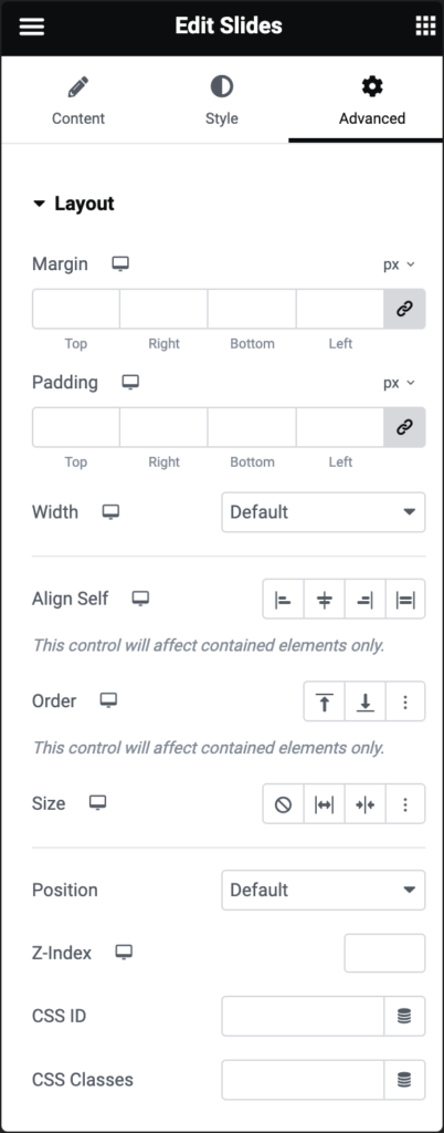
Advanced
Learn more about the Advanced tab settings.