Add the widget to the canvas
- In Elementor Editor, click +.
All available widgets are displayed. - Click or drag the widget to the canvas. For more information, see Add elements to a page.
The Table of Contents widget automatically generates a list of links based on the headings or sections you’ve defined in your content. No need to manually create these links! The widget automatically scans your content for headings (H1, H2, etc.) and arranges them into a clickable list.
Although the process is automatic, you can control what gets included and excluded from the display.
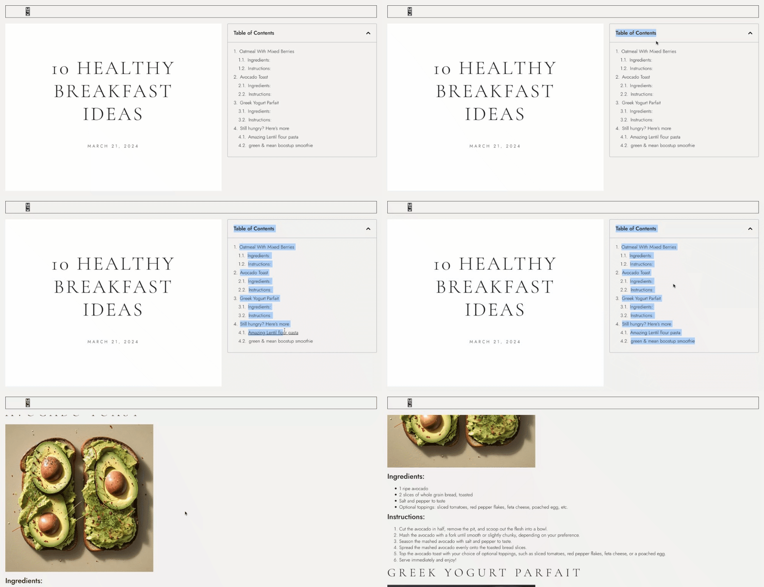
Sarah is a food blogger working on a blog post about 10 Healthy Breakfast Ideas. The post is quite lengthy, covering various recipes, ingredients, cooking instructions, and nutritional information.
So, to enhance the navigation experience, Sarah decided to add a Table of Contents at the top of the post to create a navigational aid for the readers. Instead of scrolling through the entire article to find a specific recipe, visitors can glance at the Table of Contents, click on the recipe they’re interested in, and jump directly to that section.
Sarah starts by adding headings to her blog post, such as Oatmeal with Mixed Berries and Avocado Toast. As they add these headings, the widget automatically generates a list of links in the Table of Contents widget.
When visitors land on Sarah’s blog post, they are welcomed with a well-organized Table of Contents at the beginning of the page. They can easily see Sarah’s breakfast ideas and click on any of them to instantly jump to that part of the article.
Not only does this improve the user experience by saving her readers time and effort, but it also encourages them to explore more of Sarah’s blog content.
- Include a table of contents in long instructional guides or tutorials to help users quickly navigate to specific steps or sections.
- Display a table of contents widget in course modules to give learners an overview of course content and enable them to navigate to specific lessons.
- Showcase the table of contents in product catalogs or catalogs for services to allow users to browse through different categories or sections of products or services.
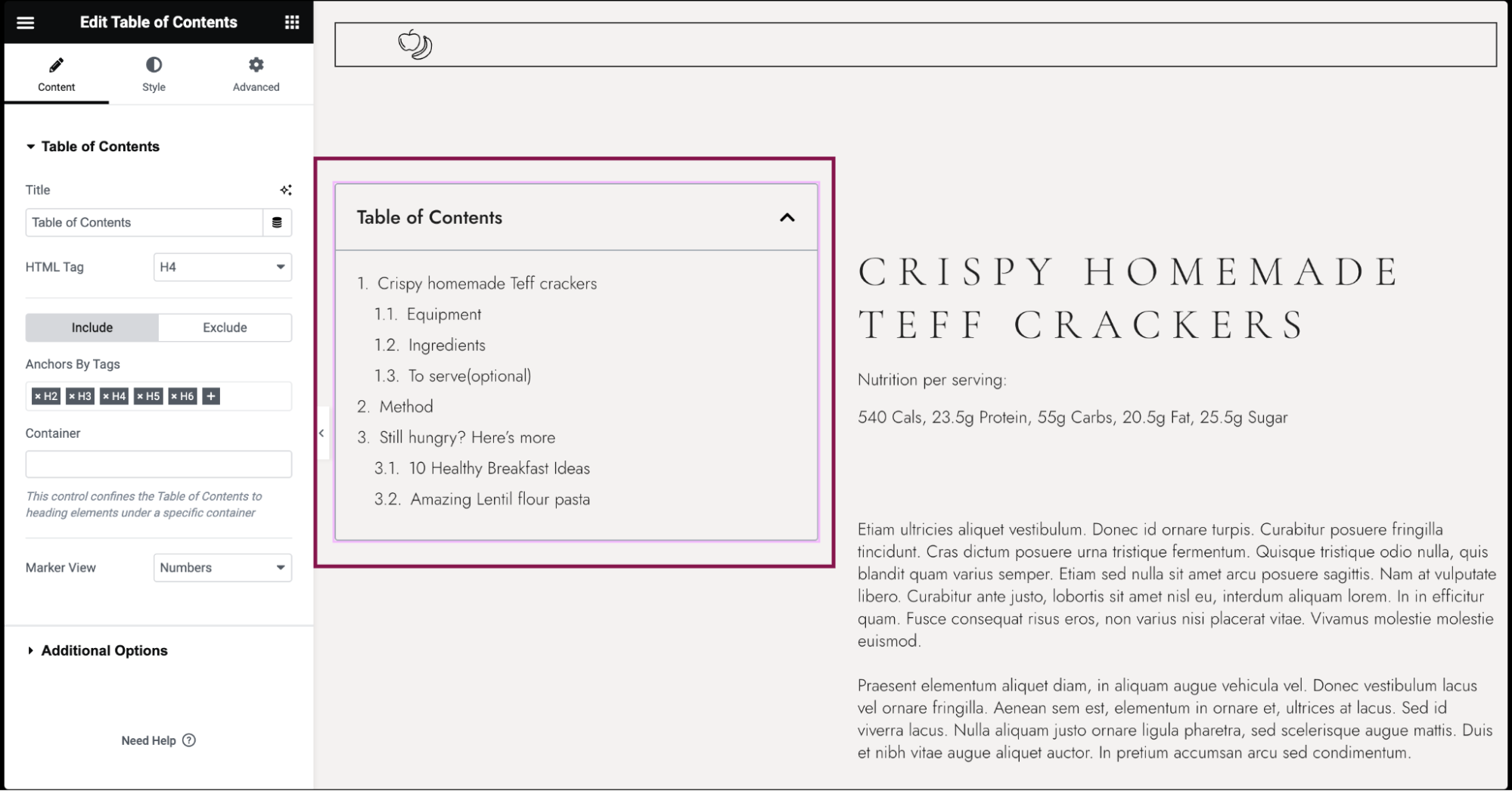
- Add the Table of Contents widget to the canvas. For details, see Add elements to a page.
- When you add the widget, it automatically scans the page’s headings and creates a Table of Contents.
- In the Content tab, under the Table of Contents section, in the Title field, type the heading text displayed above the Table of Contents.
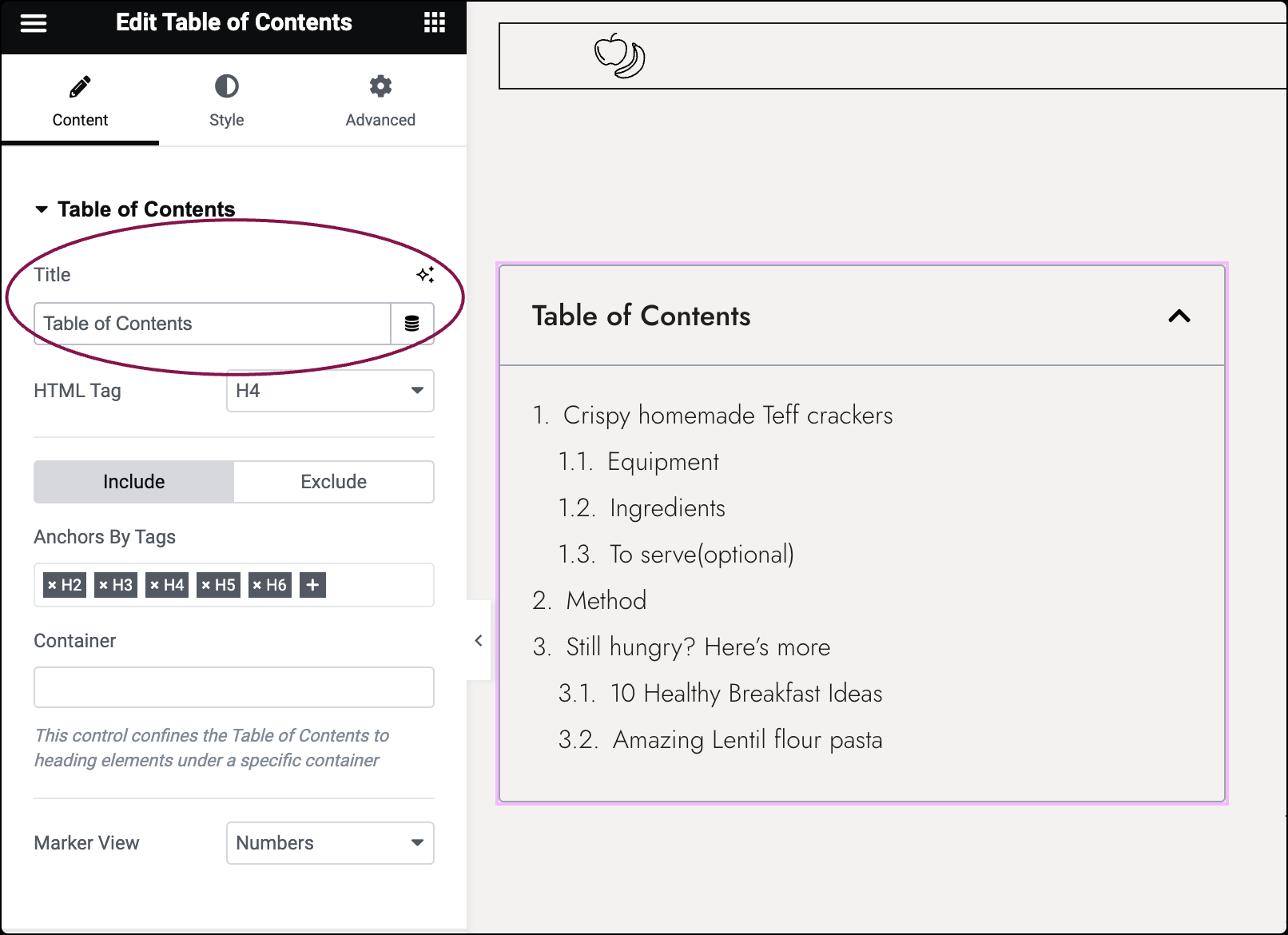
- In the HTML Tag field, select the HTML tag to use for the title, from H2 to H6, or div.
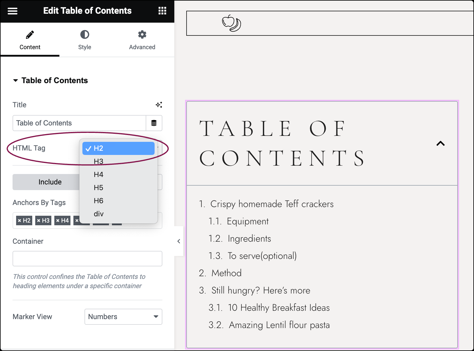
- Click the Include button to include headings from the Table of Contents.
- Anchors By Tags: Select the page’s H1-H6 tags to be automatically included. For example, if you select H2 and H3, only the headings of these levels will be included in your TOC.
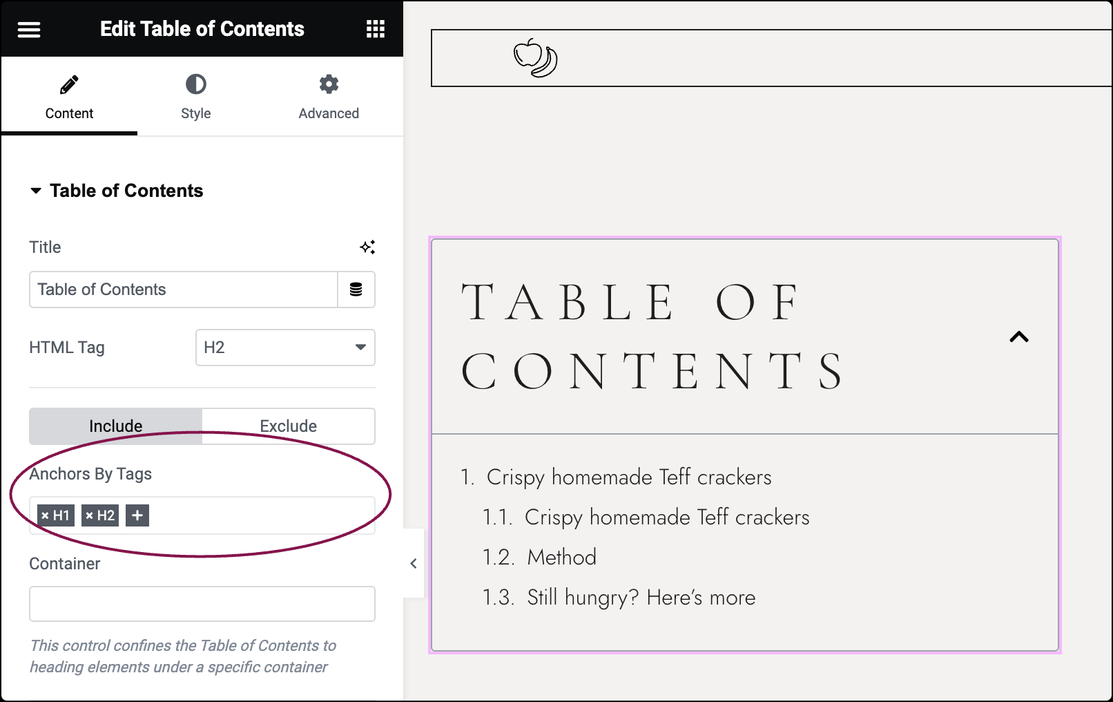
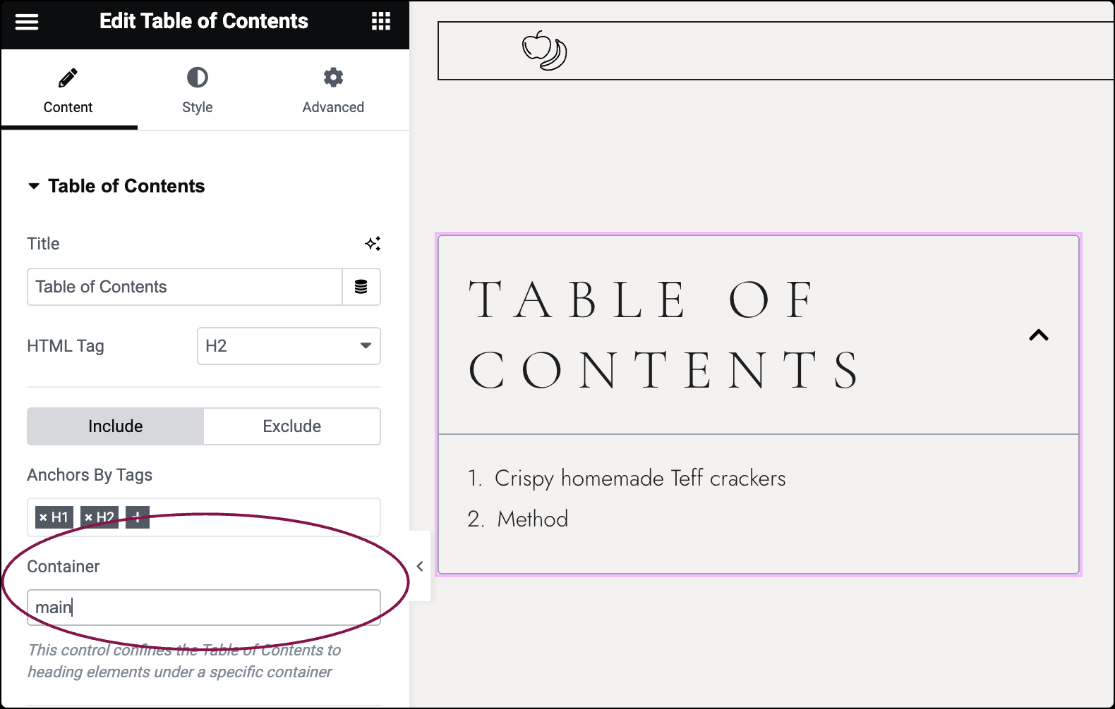
- Container: Limits the Table of Contents to headings within a specific container. This is particularly useful when you want to limit the TOC to headings within a certain section of your page.ExampleSet the HTML tag of the Container that your content resides in to “Main”. Then, in your Table of Contents widget, use “main” in the Container field.TipIf you create a Single Post or Page template, this will be the Container that your Post Content widget resides in. All new posts/pages will use the TOC for headings in WordPress or Elementor content. This is the best use for the feature as it will not display unrelated headings from other parts of the template.
- Anchors By Tags: Select the page’s H1-H6 tags to be automatically included. For example, if you select H2 and H3, only the headings of these levels will be included in your TOC.
- Click the Exclude button to exclude specific headings from the Table of Contents.
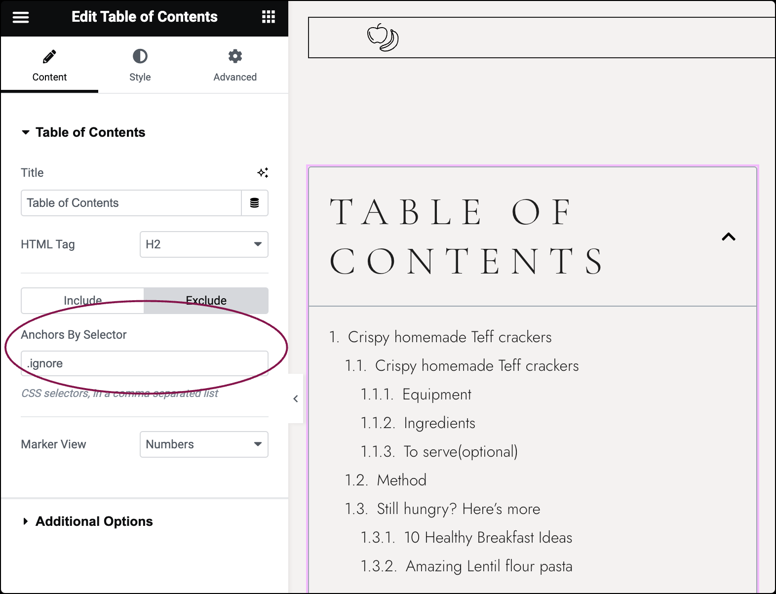
- In the Anchors By Selector box, enter CSS selectors to be excluded, such as widgets or container names.ExampleLet’s say you have a widget or container that you don’t want to appear in the Table of Contents. You can assign it a CSS class name (e.g., “.ignore”) and then enter that class name in the Anchors By Selector field. This ensures that any content with that class name will be excluded from the TOC.NoteRemember to refresh the editor or preview your changes in a new tab to see the updates reflected. This ensures that any changes you make to the inclusion or exclusion settings take effect properly.
 TipIf you’re using the Table of Contents widget in your Single Post or Page template and you want to hide a specific WordPress heading or block from appearing in the Table of Contents, you can do so using the “exclude CSS Class” feature in the Block’s Advanced settings.
- In the Anchors By Selector box, enter CSS selectors to be excluded, such as widgets or container names.
- From the Marker View field, choose to display numbers or bullets next to list items.
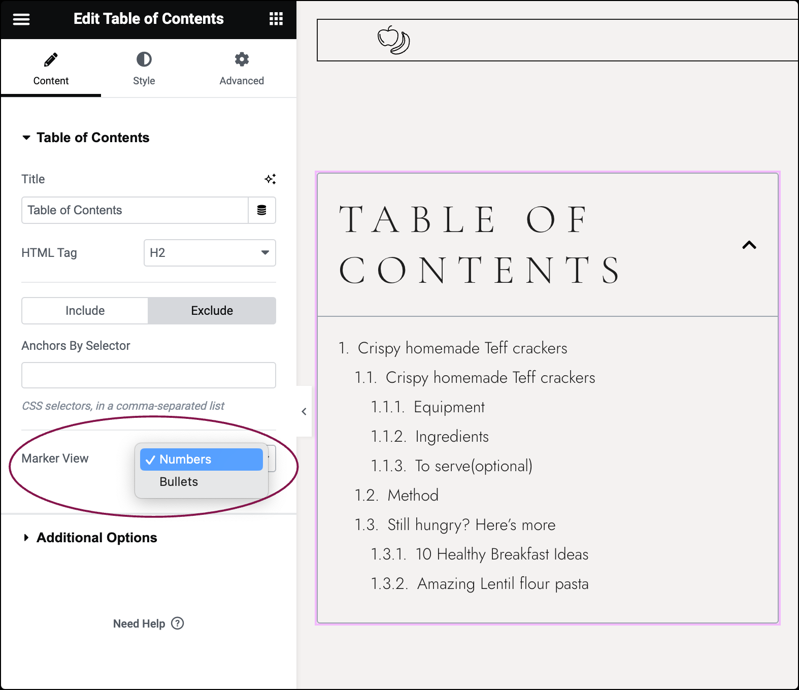
- If using Bullets, select an Icon from the Icon Library.
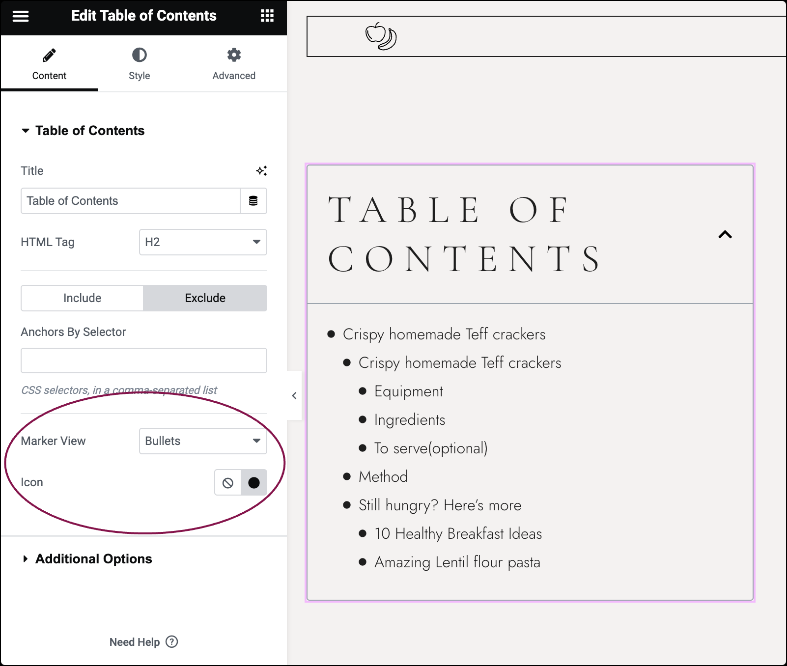
- If using Bullets, select an Icon from the Icon Library.
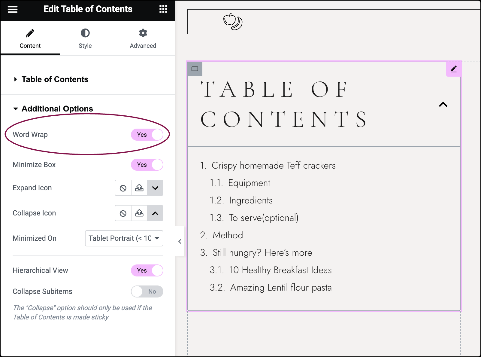
- Under Additional Options, slide the Word Wrap button Yes to wrap text when column width cannot accommodate long text on one line.
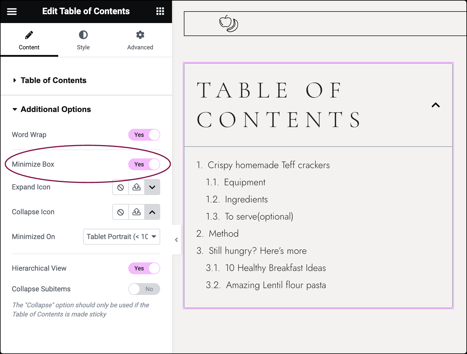
- Slide the Minimize Box to No to display the Table of Contents fully expanded. When set to Yes, users can toggle between minimizing and expanding the TOC according to their preference.
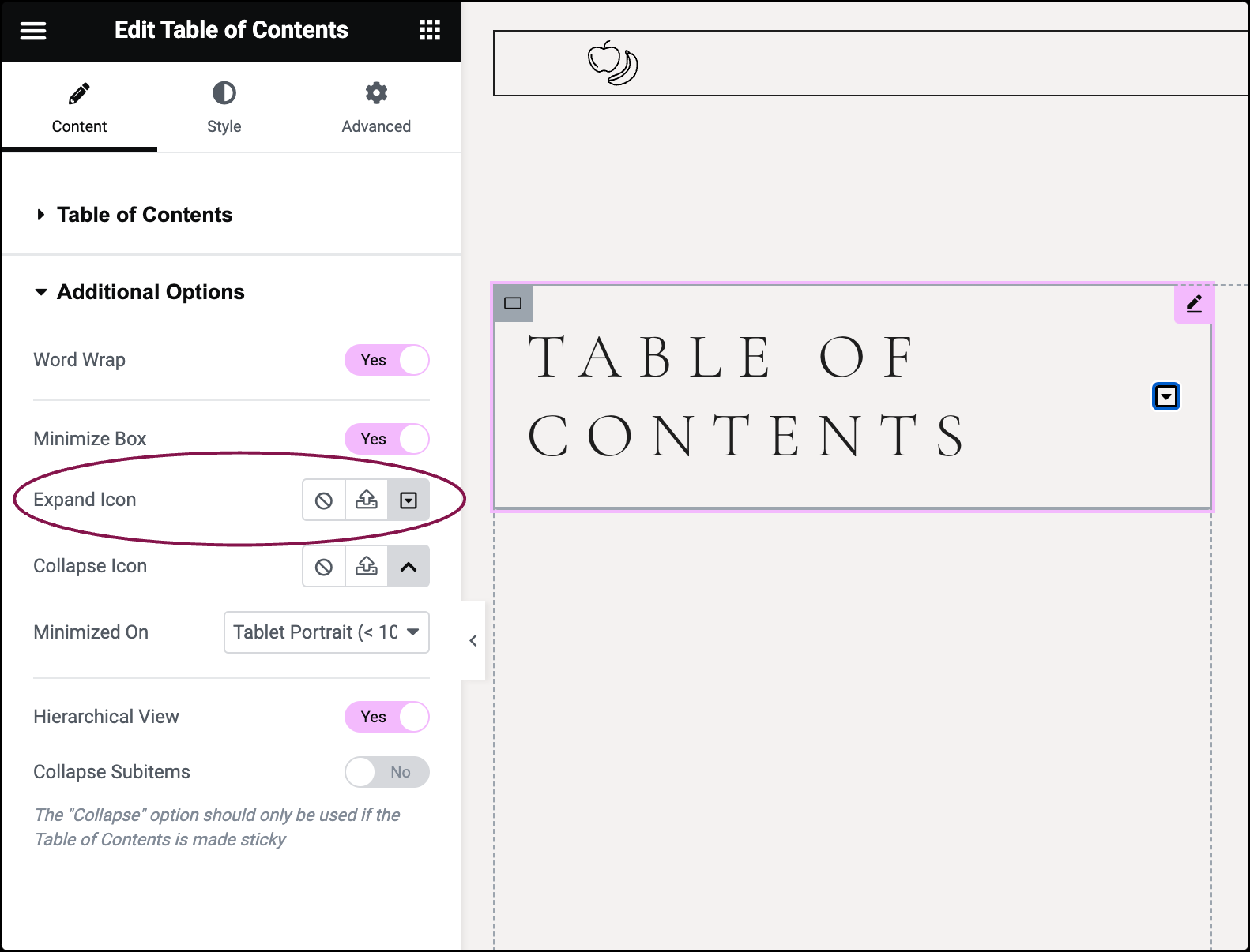
- Use the Expand Icon option to select an icon to indicate when the widget is minimized and can be expanded. You can choose an icon from the Icon Library or upload an SVG. For more details, see Enable SVG Support in Elementor.
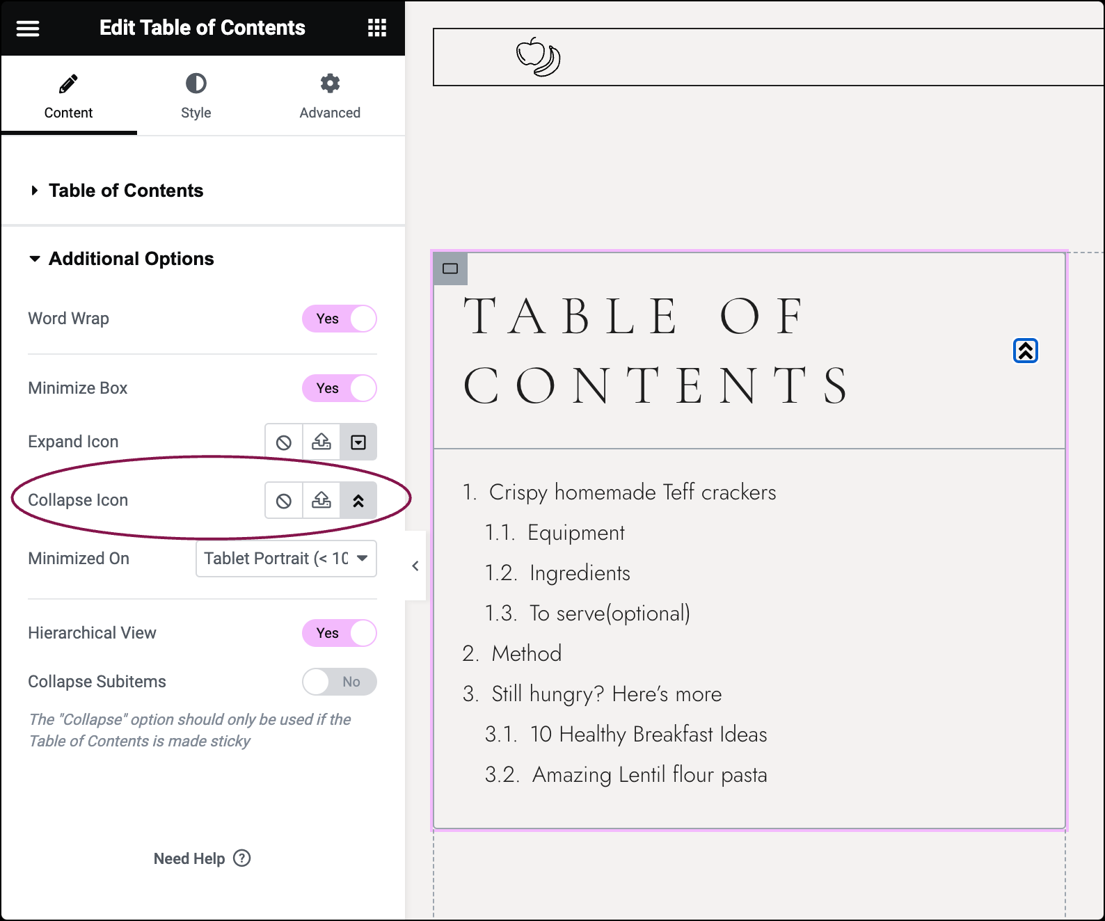
- Use the Collapse Icon option to select an icon to indicate when the widget is expanded and can be minimized. You can choose an icon from the Icon Library or upload an SVG. For more details, see Enable SVG Support in Elementor.
- Use the options in the Minimized On field to select when the widget should be minimized (Desktop, Mobile, Tablet, or None).
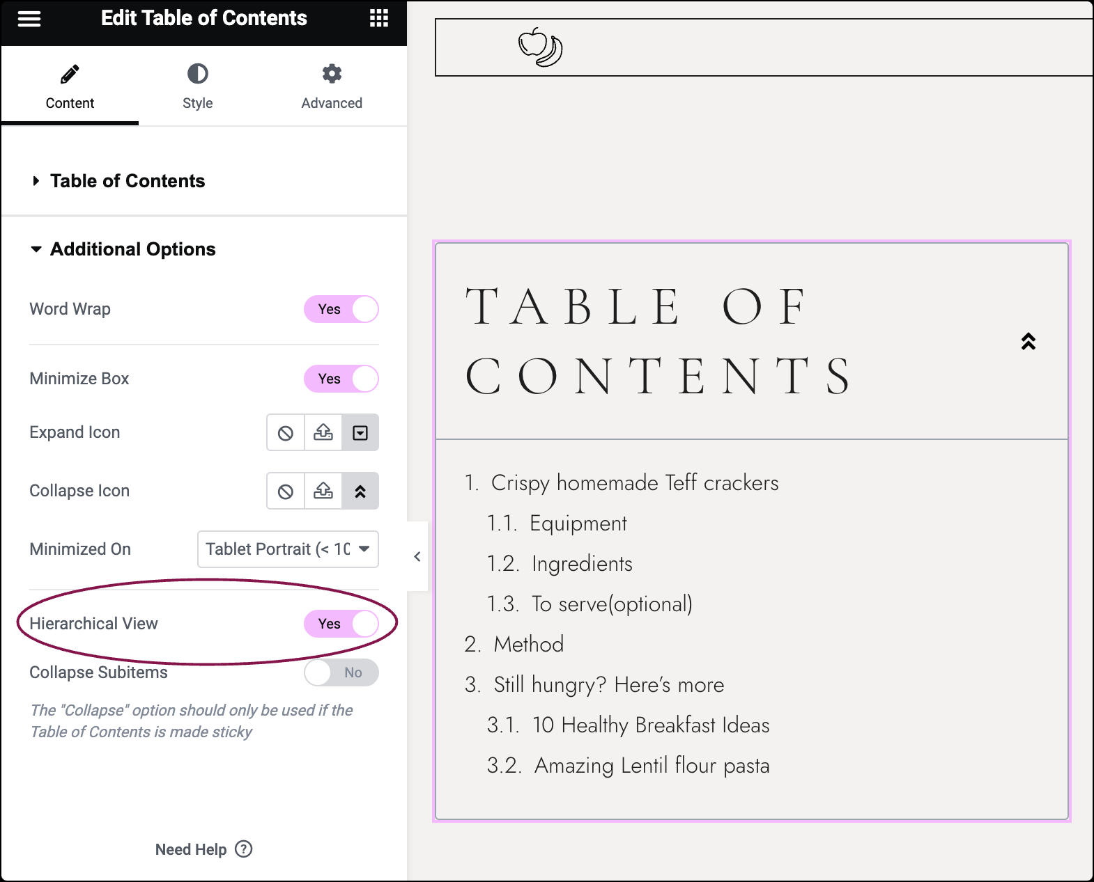
- Slide the Hierarchical View button to Yes to display list items with indention based on Tag hierarchy.
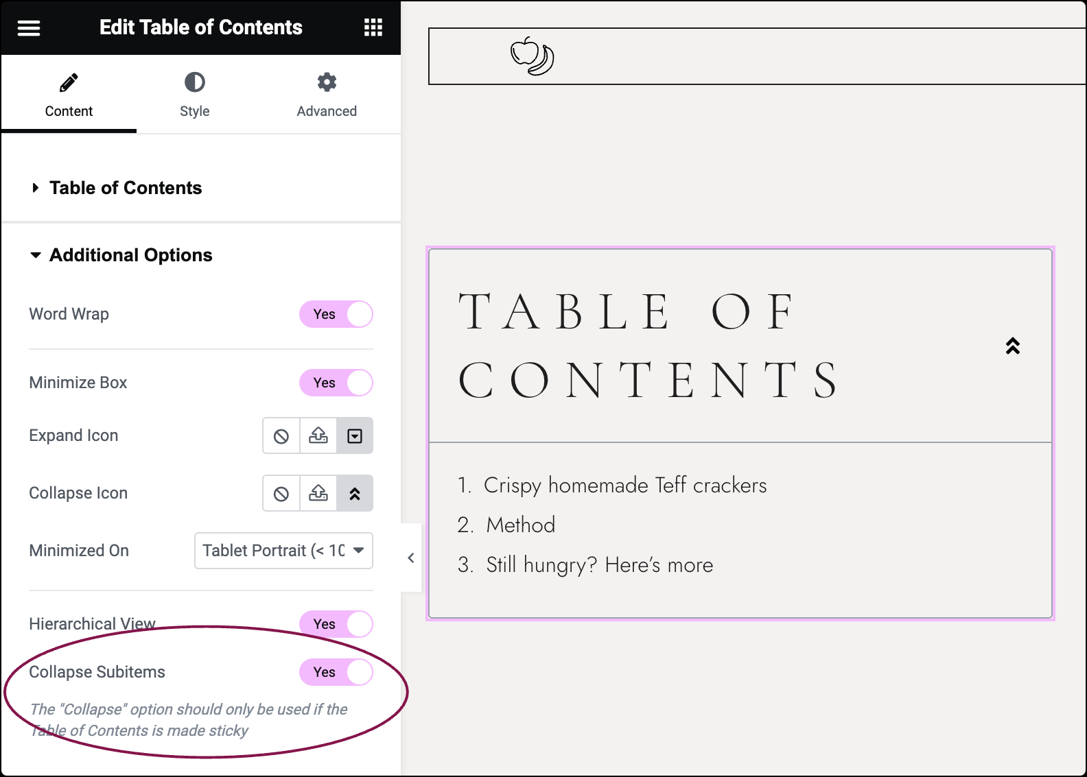
- If Hierarchical View is enabled, slide the Collapse Subitems Items button to Yes to collapse nested lists and only show top-level items.
 NoteThe Collapse option should only be used if the Table of Contents is made sticky.
You can customize your widgets using content, style, and other advanced parameters, offering you great flexibility in tailoring them to your needs. Click the tabs below to see all the settings available for this widget.
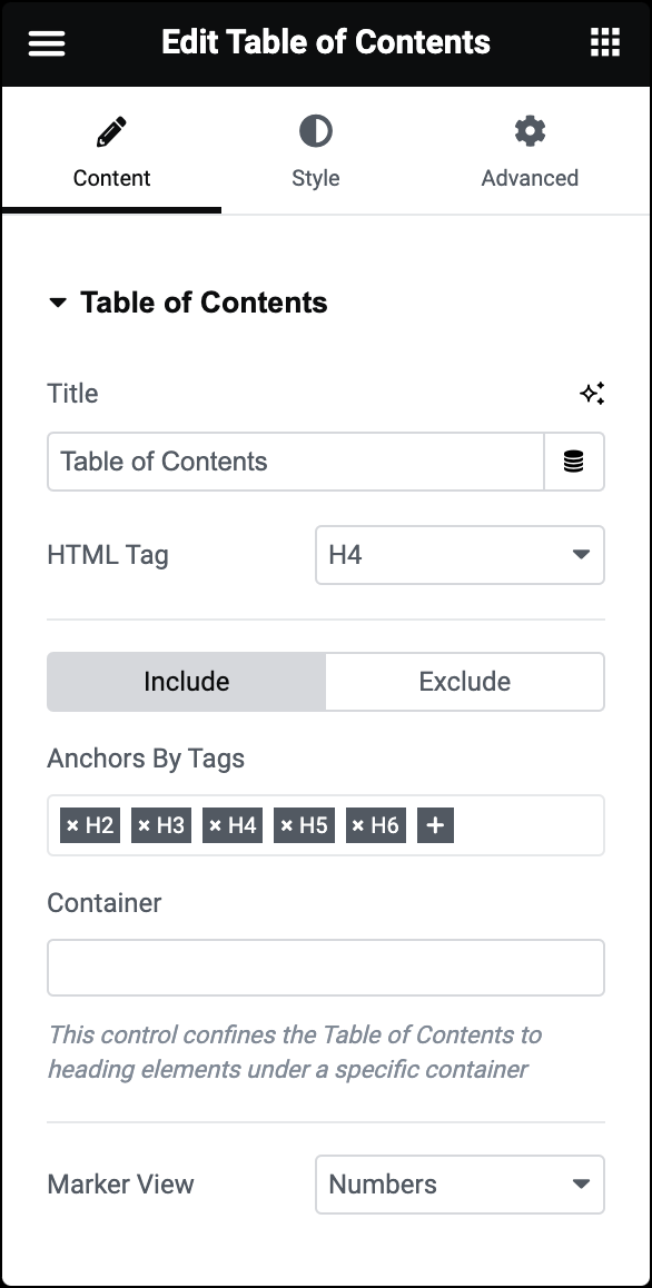
Title
Type the heading text shown above the Table of Contents.
HTML Tag
Select the HTML tag to use for the title, from H2 to H6, or div.
Include
Click this button to include headings from the Table of Contents.
- Anchors By Tags: This option lets you automatically include specific headings (H1-H6 tags) from your page in the Table of Contents (TOC). For example, if you select H2 and H3, only the headings of these levels will be included in your TOC.
- Container: The container option confines the Table of Contents to heading elements under a specific container. This is particularly useful when you want to limit the TOC to headings within a certain section of your page. For instance, if you set the container to “Main,” the TOC will only include headings within the HTML wrapper labeled “Main.”
Exclude
Click this button to exclude specific headings from the Table of Contents.
Anchors By Selector: This option allows you to specify CSS selectors to exclude certain elements from the Table of Contents. For instance, if you want to hide the contents of a specific widget or container from the TOC, you can enter its CSS class name here.
Marker View
Choose to display numbers or bullets next to list items.
If set to Bullets, click the Icon Library to choose an icon or click None to not use any icon.
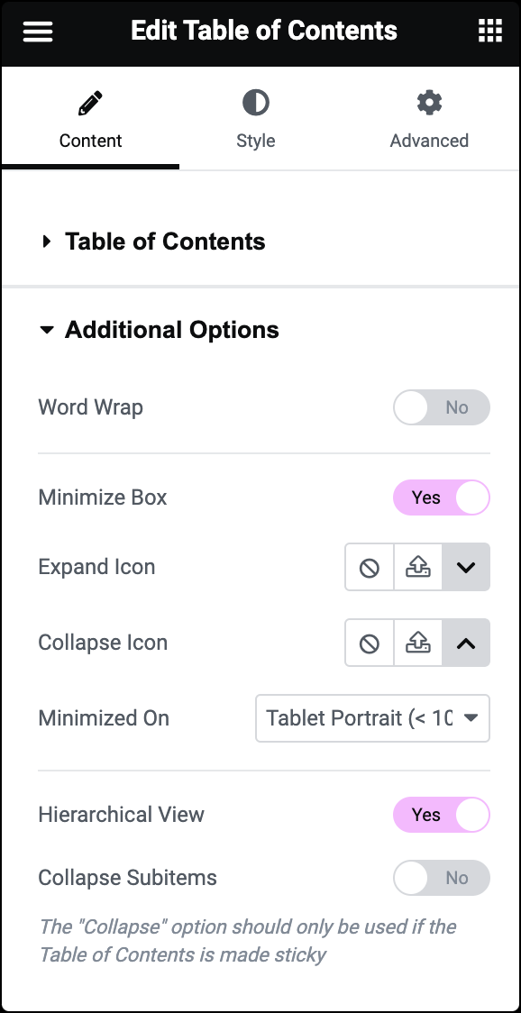
Word Wrap
Slide to Yes to wrap text when column width cannot accommodate long text on one line.
Minimize Box
Slide to No to display the Table of Contents fully expanded or Yes to force a click to expand a minimized Table of Contents box.
Expand Icon
Choose an icon to indicate when the widget is minimized and can be expanded. You can choose an icon from the Icon Library or upload an SVG. For more details, see Enable SVG Support in Elementor.
Collapse Icon
Choose an icon to indicate when the widget is expanded and can be minimized. You can choose an icon from the Icon Library or upload an SVG. For more details, see Enable SVG Support in Elementor.
Minimized On
Select to minimize on Desktop, Mobile, Tablet, or None.
Hierarchical View
Slide to Yes to display list items with indention based on Tag hierarchy.
Collapse Subitems
This option is only available if Hierarchical View is set to Yes.
Slide to Yes to collapse nested lists and only show top level items
Note: The Collapse option should only be used if the Table of Contents is made sticky.
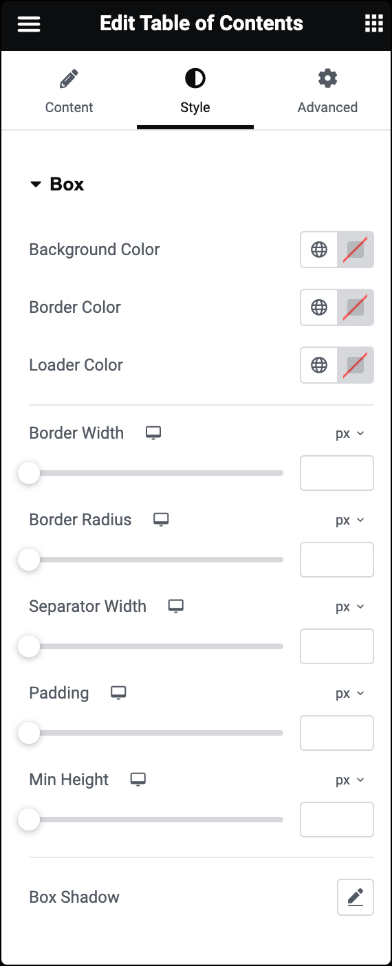
Background Color
Choose a background color for the entire Table of Contents box.
Border Color
Choose a color for the box’s border.
Loader Color
Choose a color for the loader spinner.
Border Width
Use a slide to set the width of the box’s border.
Border Radius
Use a slider to set the border radius to control corner roundness. For details, see Border radius.
Separator Width
Use a slider to set the thickness of the header’s bottom border.
Padding
Use a slider to set the padding within the border of each slide. For details, see Padding and margins.
Min Height
Set the minimum height of the widget.
Box Shadow
Set the box shadow options.
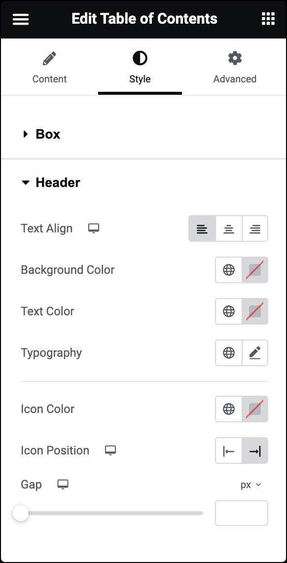
Text Align
Set alignment of the header text: Start, Center, or End.
Background Color
Choose a background color for the header.
Text Color
Choose a color for the header text.
Typography
Change the typography options for the header text. Learn more about Typography.
Icon Color
Choose the color of the Expand and Minimize icon.
Icon Position
Set icon position.
Gap
Use a slider to adjust the gap between icon and header text.
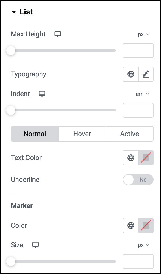
Max Height
Use a slider to adjust the height of the anchors’ box.
Typography
Change the typography options for the anchor text. Learn more about Typography.
Indent
Use a slider to set the amount of indentation for the anchors.
Text Color
Color: Choose the anchor text color for Normal, Hover and Active states.
In the Hover state, you can set Transition Duration. This is the length of time it takes for the label to change its appearance.
Underline
Select Yes to underline the anchor text.
Marker
- Color: Choose a color for the marker
- Size: Change the size of the marker if you wish it to be a different size than the text.
The Advanced tab provides options to control widget position, adjust spacing, add custom code, and more.
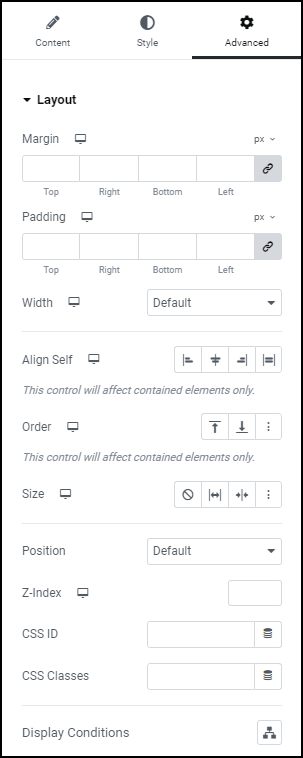
Advanced
Learn more about the Advanced tab settings.