Add the widget to the canvas
To access and use a widget:
In Elementor Editor, click +.
All available widgets are displayed.Click or drag the widget to the canvas. For more information, see Add elements to a page.
A video playlist is a collection of videos organized to play one after the other. This provides visitors with a pre-arranged and continuous viewing experience.
See all the options available with the Video Playlist widget.
Taylor is building a website to promote their classes in website building. To give potential students a taste of what the classes are like, Taylor prepares short video summaries of each class.
They then put this these summaries in a video playlist which can be played sequentially. This lets visitors experience what an entire course would be like.
- Sets of instructional videos
- Grouping together sets of videos for visitors with different interests
- Groups of travel videos for different destinations
See a video demonstrating the widget in action.
In the example below, we’ll create a menu with four menu items – Home, Store, Blog and Contact Us.
By default, the Layout section of the Content tab, Contains three menu items: Item #1, Item #2 and Item #3.
In this example, we’ll rename these menu items and then add a fourth item.
Add a video playlist
To add a video playlist widget: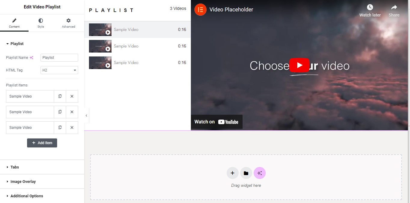
- Add the Video Playlist widget to the canvas. For details, see Add elements to a page.
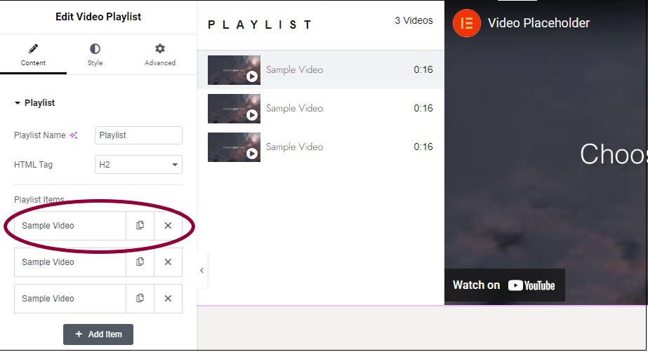
- In the panel, click on the topmost item named Sample video.
Clicking the menu item in the panel opens up several options: Type, Link, Get Video Data, Title, Title HTML Tag, Duration, Thumbnail and Content Tabs.
Now, let’s add a video to the playlist.For this example, we’ll add a video from the Elementor YouTube channel, Getting Started with Elementor Containers.
- Copy the link to the video you want to add to the playlist.infoNoteYou don’t have to link to external videos. There is an option to select Self Hosted videos that you can share from your Media Library.
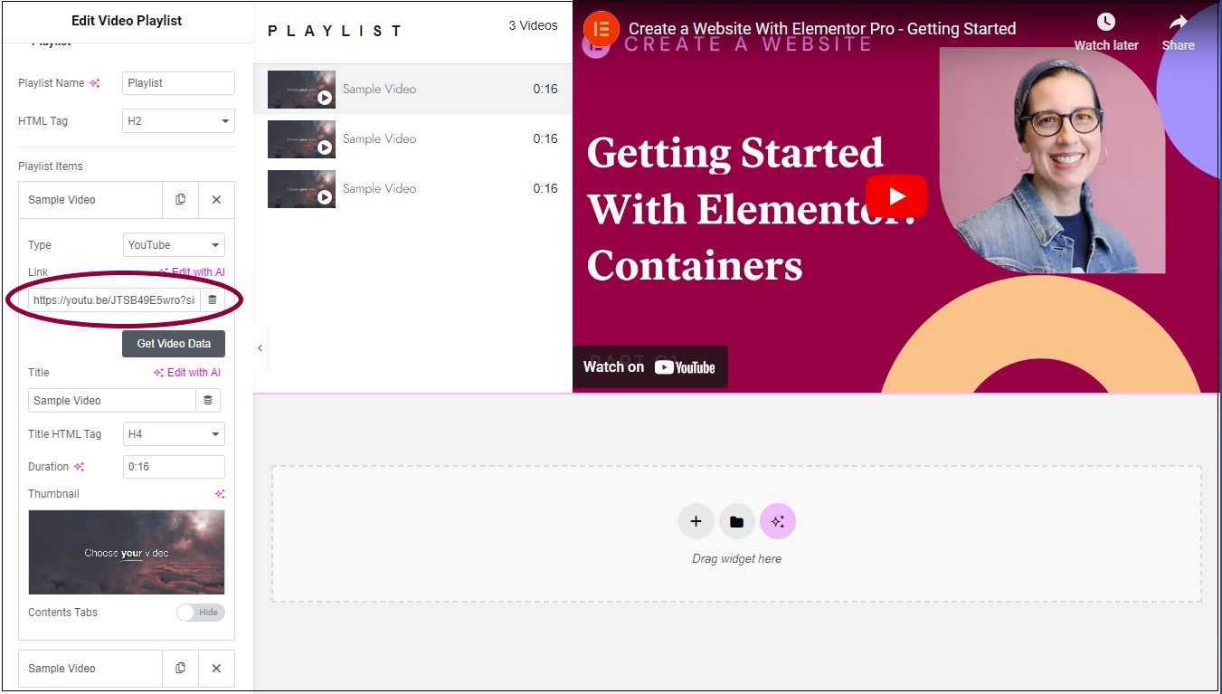
- In the panel, paste the link to the YouTube channel in the Link field.
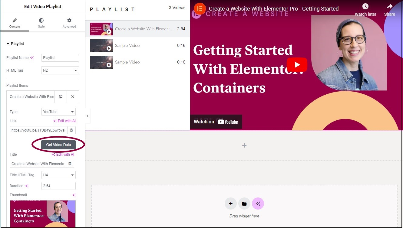
- In the panel, click Get Video Data. This will automatically grab the information from YouTube, filling in the Title, Duration and Thumbnail. These can all be manually edited.

- In the Title field, change the name of the video to Getting Started. Shorter names are often preferable in playlists.
A thumbnail is a small image representing the video. The get video function grabbed the default thumbnail, but we can replace it.
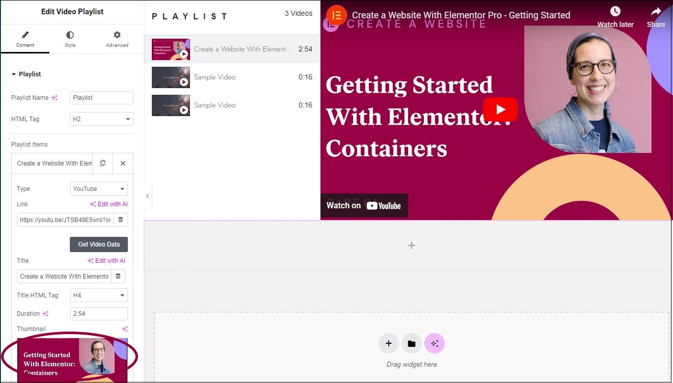
- In the panel, in the Thumbnail section, click the default thumbnail image and add a different image. For more details, see Add images and icons.
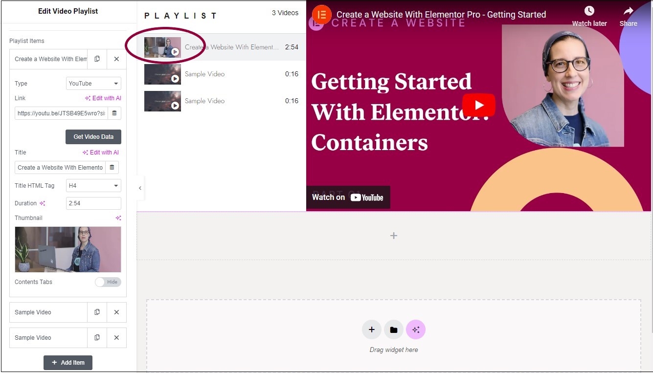
The new thumbnail appears in the playlist.
You can customize your widgets using content, style, and other advanced parameters, offering you great flexibility in tailoring them to your needs. Click the tabs below to see all the settings available for this widget.
Add, delete, and edit playlist items and controls.
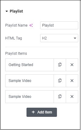
Playlist Name
Give a name to your video playlist.
HTML tag
Give the Playlist name an HTML tag of H1- H6, Div, or Span. Use the dropdown menu to designate the title as a header (H1-6). This helps search engines find and understand the playlist, boosting SEO. The title can also be tagged as a paragraph, span or div.
Playlist Items
Edit and create playlist items. Next to the item name are two icons used to add and delete items:
– Duplicate this playlist item. Using copy helps maintain consistency in your playlist.
![]() – Delete this playlist item.
– Delete this playlist item.
When you click an item, additional options appear. Open an item to edit the following fields:
- Type: Use the dropdown to select among the compatible video formats: YouTube, Vimeo, and Self Hosted. YouTube and Vimeo require links to the videos, Self Hosted videos are uploaded from the Media Library. There is a fourth option, Section. This will place a text section between the playlist items. This is a good way to divide your video playlist into different groups. For example, Videos for beginners and Videos for advanced users.
- Get Video Data: Automatically grabs the title, duration and thumbnail from YouTube or Vimeo.
- Title: Give this video a name that will be displayed in the playlist.
- HTML tag: Give the video name an HTML tag of H1- H6, Div, or Span. Use the dropdown menu to designate the title as a header (H1-6). This helps search engines find and understand the video, boosting SEO. The title can also be tagged as a paragraph, span or div..
- Duration: Limit the length of the video in the playlist.
- Thumbnail: Add an image to represent the video in the playlist.
- Content tabs: Optionally, tabs can appear below the playlist and can be used to describe the contents of the video. Toggle to Show in order to add these tabs. By default, two tabs will appear but and empty tab is not displayed. Name the tab in the Tab section of the Content tab.
+Add item
Click to add a blank playlist item.
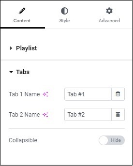
Tabs
If you chose to add tabs to playlist items, enter a tab name(s).
Collapsible
Toggle to Show if you want to limit the amount of text visible to visitors. This will bring up the following options:
- Read More Label: Edit the label used when visitors want to expand the tab text.
- Read Less Label: Edit the label used when visitors want to contract the tab text.
- Height: Set the amount of tab space visible to visitors.
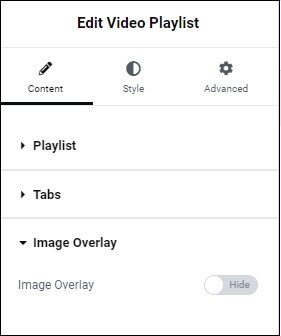
Image Overlay
Set an image that will be displayed in the area where videos will be shown. For example, if you want your company logo or a standard image prominently displayed in the video widget. The overlay disappears when the video begins playing. If you choose to Show an Image Overlay, you will have the following options:
- Choose Image: Select an image to use. For more details, see Adding images and icons.
- Image Resolution: Choose which image size to use.
- Play Icon: Replace the standard play symbol with an icon from the icon library or with an SVG image.
Alignment
Set the icon representing the dropdown to the right, left or center.
Normal
How the icon will appear by default.
Hover
How the icon will appear when a visitor mouses over it.
Active
How the icon will appear when a visitor clicks on it.
Icon
Select the icon that will represent the menu. Learn more about icons.
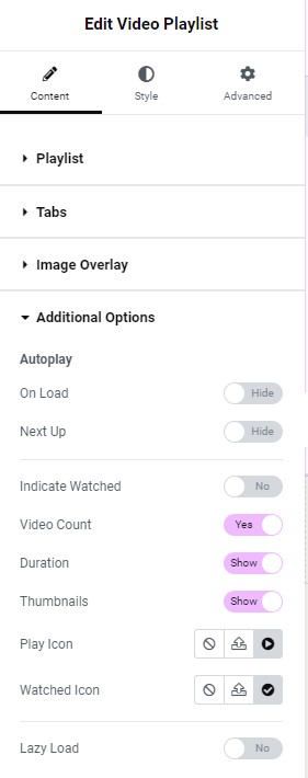
Autoplay
Determine if the videos in the list will play without visitors clicking the play icon.
- On Load: Toggle to Show to have the videos in the list play when the playlist appears on the page.
- Next Up: Toggle to Show to have the videos play in succession.
Indicate watched
Toggle to Yes to display an icon showing visitors they have seen a video.
Video Count
Toggle to No to hide the number of videos in the playlist.
Duration
Toggle to Hide in order not to display the duration of each video in the playlist.
Thumbnails
Toggle to No in order not to display the video thumbnails.
Play icon
Set the icon used for the Play button:
 – Click for no play icon
 – Click to upload an SVG icon
 – Click to choose a play icon from the icon library
Played icon
Set the icon used to show that a video has been shown:
 – Click for no played icon
 – Click to upload an SVG icon
 – Click to choose a played icon from the icon library
Determine the look and feel of menu items and controls.
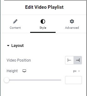
Video Position
Click the icons to determine whether the video will play on the right or left side of the Video Playlist widget.
Height
Use the slider to determine the the height of the video in the play area.
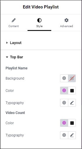
Playlist Name
Determines how the Playlist Name is displayed:
- Background: Add a background to the playlist name. For more details, see Create a Background.
- Color: Set a color for the text of the playlist name. For more details, see Choose a color or Use global fonts and colors.
- Typography: Determine the size and type of font used for the playlist name. For more details, see Typography.
Video Count
Determines the look and feel of the display showing how many videos are in the playlist:
- Color: Set a color for the text of the video count. For more details, see Choose a color or Use global fonts and colors.
- Typography: Determine the size and type of font used for the video count. For more details, see Typography.
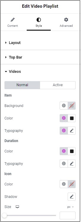
Normal
How the list will appear by default.
Hover
How the list will appear when visitors mouse over it.
Item
Determine the look and feel of the list area:
- Background: Set a background color for the list area. For more details, see Create a Background.
- Color: Set a color for the text of the list area. For more details, see Choose a color or Use global fonts and colors.
- Typography: Sent a font type and size for the list area. For more details, see Typography.
Duration
Determine the look and feel of the duration numbers in the list area:
- Color: Set a color for the duration numbers in the list area. For more details, see Choose a color or Use global fonts and colors.
- Typography: Sent a font type and size for the duration numbers in the list area. For more details, see Typography.
Icon
The thumbnails in the list area display either a play or played icon. This section determines the look of those icons:
- Color: Set a color for the icon’s background. For more details, see Choose a color or Use global fonts and colors.
- Shadow: Click the pencil icon
to add a shadow to the icon. For more details, see, What is Shadow?
- Size: Use the slider to determine how big the icon will be. Learn more about units of measurement.
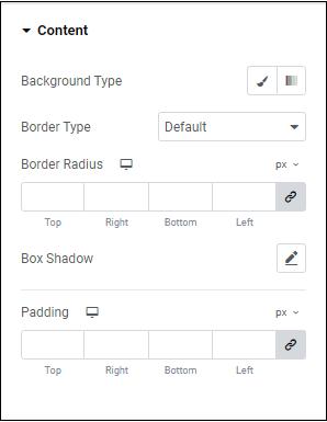
Background type
Add a background to any sections in your playlist. Learn more about backgrounds.
Border type
Add a border to the sections in your playlist. Learn more about border types.
Border Radius
Round the corners of any borders around the sections in your playlist. For more details, see Border radius tools.
Box Shadow
Click the pencil icon to add a box shadow to any sections in your playlist. Learn more about shadows.
Padding
Add space around any sections in your playlist. Learn how to create space with padding and margins.
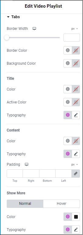
Tabs
Determine the look and feel of any tabs in the playlist:
- Border Width: Set the thickness of any borders around the tabs. If set to zero, there will be no border.
- Border Color: Set a border color for the tab. For more details, see Choose a color or Use global fonts and colors.
- Background Color: Add a background color to the tab. For more details, see Choose a color or Use global fonts and colors.
Title
Determine the look and feel of the tab title.
- Color: Set the tab title’s default color. For more details, see Choose a color or Use global fonts and colors.
- Active color: Set the tab title’s color after a visitor clicks it. For more details, see Choose a color or Use global fonts and colors.
- Typography: Select a font size and type for the tab title. For more details, see Typography.
Content
Determine the look and feel of the text in the tab.
- Color: Set the text color. For more details, see Choose a color or Use global fonts and colors.
- Typography: Select a font size and type for the tab text. For more details, see Typography.
- Padding: Create space around the tab text. For more details, see Padding and margins.
Show More
Determine the look and feel of the Show More and Show Less text that expands and contract the tab.
- Color: Set the text color. For more details, see Choose a color or Use global fonts and colors.
- Typography: Select a font size and type for the text. For more details, see Typography.
Normal
How the Show More and Show Less text will appear by default.
Hover
How the Show More and Show Less text will appear by when visitors hover over them.
Hover mode lets you set a transition duration. This is the length of time it takes for the tab to change its appearance.
Control the placement of your widget, insert links, add custom code and more.
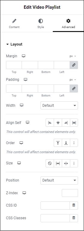
Advanced
Learn more about the Advanced tab settings.

